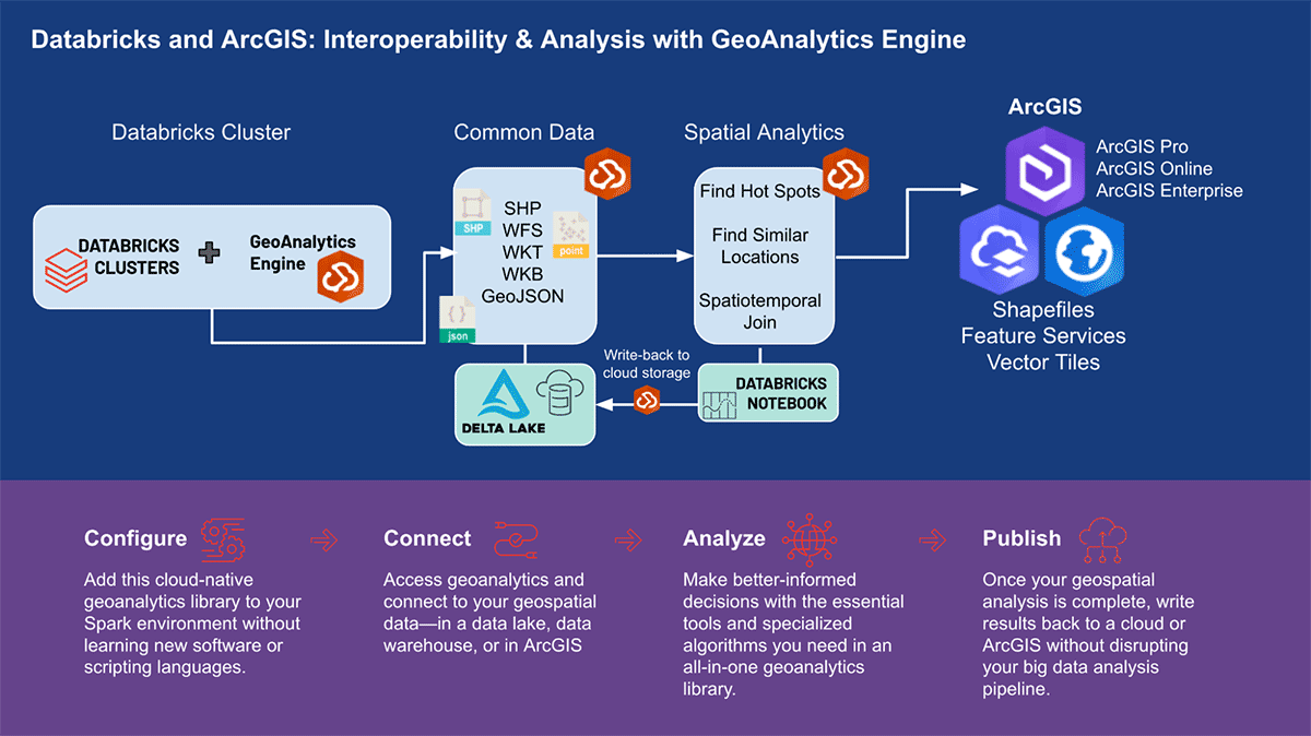
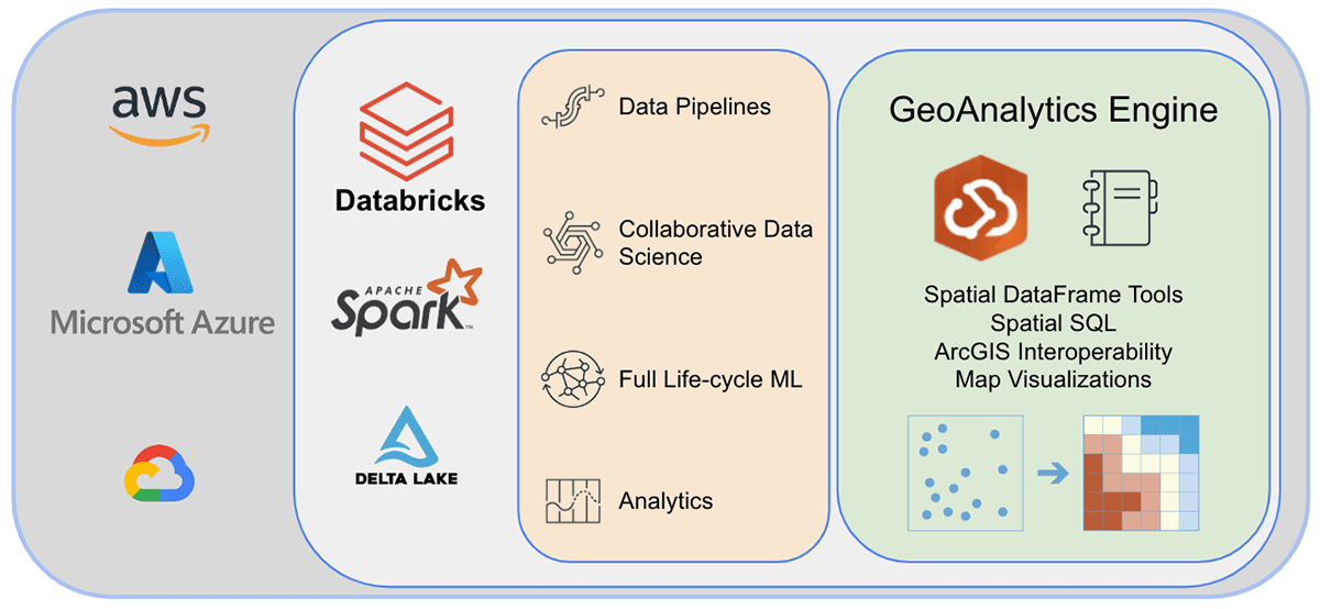
Databricks의 ArcGIS GeoAnalytics Engine
데이터 과학 워크플로우에서의 확장 가능한 지리 공간 분석
작성자: 켄트 마튼 , Arif Masrur
This is a collaborative post from Esri and Databricks. We thank Senior Solution Engineer Arif Masrur, Ph.D. at Esri for his contributions.
빅데이터의 발전은 모든 산업 분야의 조직이 중요한 과학적, 사회적, 비즈니스 문제를 해결할 수 있도록 지원했습니다. 빅데이터 인프라 개발은 데이터 분석가, 엔지니어, 과학자가 빅데이터를 다루는 핵심 과제인 볼륨, 속도, 정확성, 가치, 다양성을 해결하는 데 도움을 줍니다. 하지만 방대한 지리공간 데이터를 처리하고 분석하는 것은 그 자체로 어려움이 있습니다. 매일 수백 엑사바이트의 위치 기반 데이터가 생성됩니다. 이러한 데이터 세트에는 실제 개체 간의 광범위한 연결과 복잡한 관계가 포함되어 있어, 공간 및 시공간 조인과 같은 최적화된 연산을 통해 이러한 다면적인 관계를 효과적으로 연결할 수 있는 고급 도구가 필요합니다. 효율적인 규모의 분석을 위해 수집, 검증 및 표준화해야 하는 수많은 지리공간 형식은 복잡성을 더합니다.
지리 데이터를 다루는 데 따르는 어려움 중 일부는 Databricks에서 최근 발표된 내장 H3 표현식 지원으로 해결됩니다. 하지만 지오메트리보다는 그리드 인덱스에 더 중점을 두거나 더 복잡한 여러 지리공간 사용 사례가 있습니다. 사용자는 Databricks 플랫폼에서 다양한 도구와 라이브러리를 활용하면서 수많은 Lakehouse 기능을 이용할 수 있습니다.
세계 최고의 GIS 소프트웨어 공급업체인 Esri는 앞서 언급한 지오분석 과제를 해결하기 위해 ArcGIS Enterprise, ArcGIS Pro, ArcGIS Online을 포함한 포괄적인 도구 세트를 제공합니다. Databricks를 사용하는 조�직 및 데이터 실무자는 ArcGIS 환경 외부에서 일상 업무를 수행하는 도구에 액세스해야 합니다. 그렇기 때문에 ArcGIS GeoAnalytics Engine(이하 GA Engine)의 첫 릴리스를 발표하게 되어 기쁩니다. 이 엔진을 통해 데이터 과학자, 엔지니어 및 분석가는 기존 빅데이터 분석 환경 내에서 지리공간 데이터를 분석할 수 있습니다. 특히 이 엔진은 Apache Spark™의 플러그인으로, 매우 빠른 공간 처리 및 분석 기능을 데이터 프레임에 확장하여 Databricks에서 실행할 준비가 되어 있습니다.
ArcGIS GeoAnalytics Engine의 이점
Esri의 GA Engine을 사용하면 데이터 과학자가 Databricks 환경 내에서 지오분석 함수 및 도구에 액세스할 수 있습니다. GA Engine의 주요 기능은 다음과 같습니다.
- 120개 이상의 공간 SQL 함수—Python 또는 SQL 구문을 사용하여 지오메트리 생성, 공간 관계 테스트 등 수행
- 강력한 분석 도구—몇 줄의 코드로 일반적인 시공간 및 통계 분석 워크플로 실행
- 자동 공간 인덱싱—최적화된 공간 조인 및 기타 연산 즉시 수행
- 일반적인 GIS 데이터 소스와의 상호 운용성 —Shapefile, 피처 서비스 및 벡터 타일에서 데이터 로드 및 저장
- 클라우드 네이티브 및 Spark 네이티브—Databricks에 설치 준비 완료 및 테스트됨
- 사용 용이성—직관적인 Python API를 사용하여 공간이 활성화된 빅데이터 파이프라인 구축 (PySpark 확장)
SQL 함수 및 분석 도구
현재 GA Engine은 120개 이상의 SQL 함수와 15개 이상의 공간 분석 도구를 제공하여 고급 공간 및 시공간 분석을 지원합니다. 본질적으로 GA Engine 함수는 DataFrame 열에 대한 공간 쿼리를 활성화하여 Spark SQL API를 확장합니다. 이러한 함수는 Python 함수와 함께 또는 PySpark SQL 쿼리 문에서 호출할 수 있으며, 지오메트리 생성, 지오메트리 연산, 공간 관계 평가, 지오메트리 요약 등을 가능하게 합니다. 한두 개의 열을 사용하여 행별로 작동하는 SQL 함수와 달리, GA Engine 도구는 DataFrame의 모든 열을 인식하고 필요한 경우 결과를 계산하기 위해 모든 행을 사용합니다. 이러한 광범위한 분석 도구를 통해 전체 데이터 세트를 관리, 강화, 요약 또는 분석할 수 있습니다.
|
|
GA Engine은 강력한 분석 도구입니다. 하지만 GA Engine이 일반적인 GIS 형식을 얼마나 쉽게 다룰 수 있게 하는지도 간과할 수 없습니다. GA Engine 설명서에는 Shapefile 및 피처 서비스로의 읽기 및 쓰기에 대한 여러 튜토리얼이 포함되어 있습니다. GIS 형식을 사용하여 지리공간 데이터를 처리할 수 있는 기능은 Databricks와 Esri 제품 간의 뛰어난 상호 운용성을 제공합니다.

다양한 사용 사례를 위한 GA 엔진
다양한 산업 분야의 몇 가지 사용 시나리오를 살펴보며 ESRI의 GA Engine이 대량의 공간 데이터를 어떻게 처리하는지 알아보겠습니다. 확장 가능한 공간 및 시공간 분석 지원은 모든 회사가 중요한 결정을 내리는 데 도움을 주기 위한 것입니다. 이동성, 소비자 거래, 공공 서비스라는 세 가지 다양한 데이터 분석 영역에서 지리적 통찰력을 밝히는 데 집중할 것입니다.
이동성 데이터 분석
이동성 데이터는 끊임없이 증가하고 있으며 인간 이동과 차량 이동의 두 가지 범주로 나눌 수 있습니다. 휴대폰 서비스 영역에서 수집된 스마트폰 사용자로부터의 인간 이동 데이터는 인간 활동 패턴에 대한 더 깊은 통찰력을 제공합니다. 수백만 대의 연결된 차량의 이동 데이터는 방향별 교통량, 교통 흐름, 평균 속도, 혼잡 등에 대한 풍부한 실시간 정보를 제공합니다. 이러한 데이터 세트는 일반적으로 대규모(수십억 개의 레코드)이고 복잡합니다(수백 개의 속성). 이러한 데이터는 기본 공간 분석을 넘어서는 공간 및 시공간 분석을 필요로 하며, 고급 통계 도구 및 전문 지오분석 함수에 즉시 액세스할 수 있어야 합니다.
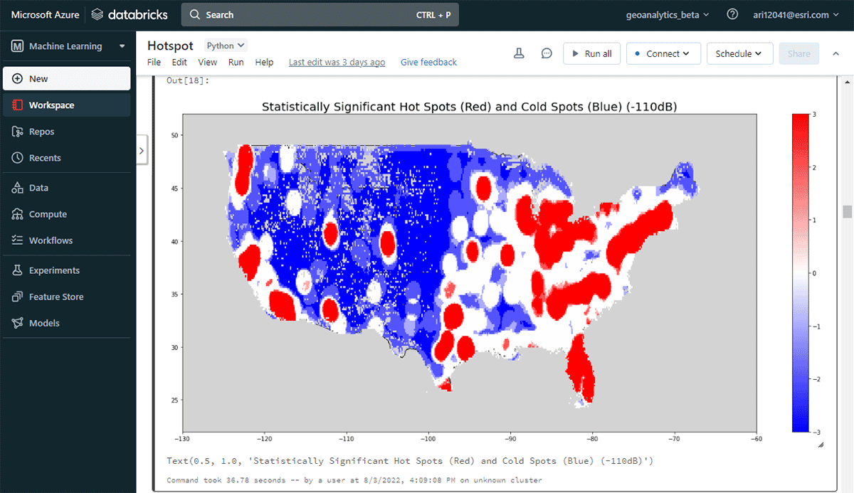
Esri 파트너 Ookla®의 Cell Analytics™ 데이터를 기반으로 인간 이동을 분석하는 예시부터 시작하겠습니다. Ookla®는 Speedtest® 애플리케이션을 기반으로 전 세계 무선 서비스 성능, 커버리지 및 신호 측정에 대한 빅데이터를 수집합니다. 이 데이터에는 소스 장치, ��모바일 네트워크 연결, 위치 및 타임스탬프에 대한 정보가 포함됩니다. 이 경우 약 160억 개의 레코드를 포함하는 데이터 하위 집합을 사용했습니다. Apache Spark(™)에서 병렬 처리에 최적화되지 않은 도구를 사용하면 이 고용량 데이터를 읽고 시공간 연산에 사용할 수 있도록 하는 데 몇 시간의 처리 시간이 소요될 수 있습니다. GeoAnalytics Engine을 사용하면 단 한 줄의 코드로 이 데이터를 몇 초 안에 parquet 파일에서 가져올 수 있습니다.
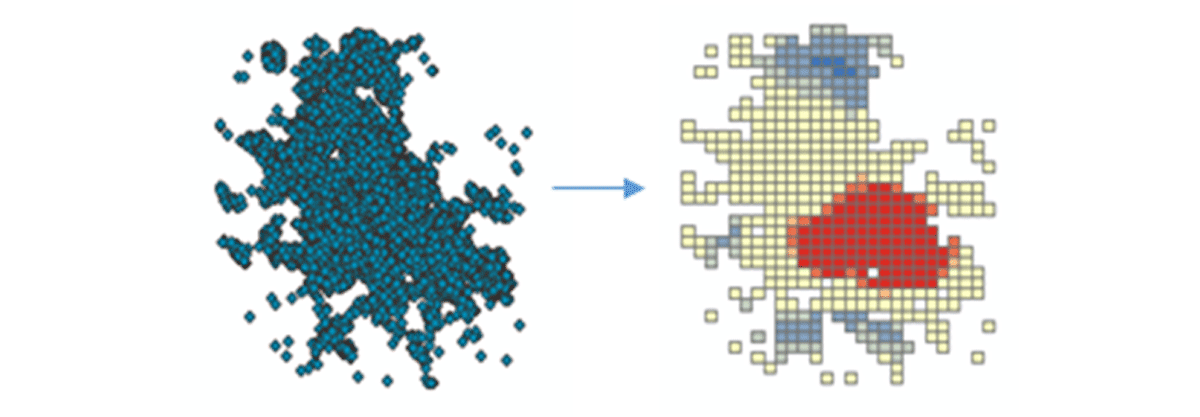
실행 가능한 통찰력을 도출하기 위해 간단한 질문으로 데이터에 대해 자세히 알아보겠습니다. 미국 본토 전역의 모바일 장치 공간 패턴은 어떻습니까? 이를 통해 인간의 존재와 활동을 특성화하기 시작할 수 있습니다. FindHotSpots 도구를 사용하여 높은 값(핫스팟)과 낮은 값(콜드스팟)의 통계적으로 유의미한 공간 클러스터를 식별할 수 있습니다.

결과로 나온 핫스팟 데이터프레임을 Matplotlib을 사용하여 시각화하고 스타일을 지정했습니다(그림 2). 미국 본토에서 연결된 기기 밀도가 낮은 지역(파란색)에 비해 기기 연결 기록(빨간색)이 많은 기록을 보여주었습니다. 예상대로 주요 도시 지역에서 연결된 기기 밀도가 더 높았습니다.
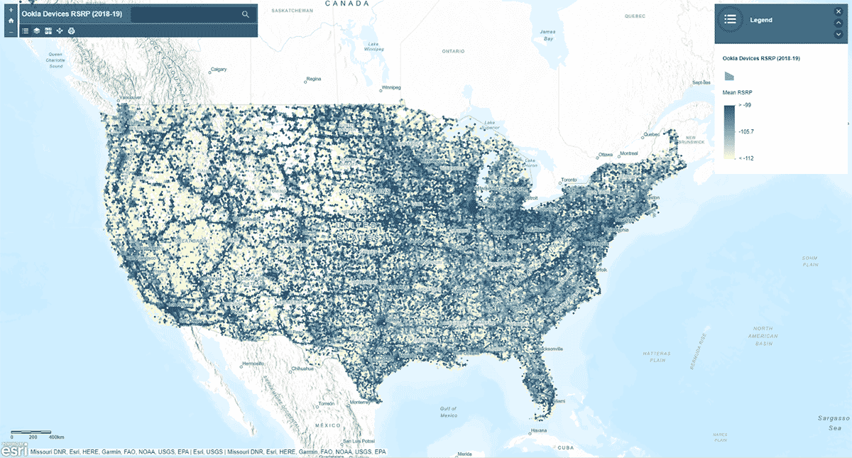
다음으로, 모바일 네트워크 신호 강도가 미국 전역에서 균일한 패턴을 따르는지 질문했습니다. 이를 답하기 위해 AggregatePoints 도구를 사용하여 기기 연결 기록을 육각형 빈으로 요약하여 특히 강력하거나 약한 셀룰러 서비스 영역을 식별했습니다(그림 3). 모바일 네트워크 신호 강도를 측정하는 데 사용되는 값인 rsrp(참조 신호 수신 전력)를 사용하여 15km 빈에 대한 평균 통계를 계산했습니다. 이 분석은 셀룰러 서비스 신호 강도가 일관되지 않으며, 대신 주요 도로망과 도시 지역을 따라 더 강한 경향이 있음을 보여주었습니다.
st_plotting을 사용하여 결과를 플로팅하는 것 외에도 arcgis 모듈을 사용하고 결과 데이터프레임을 ArcGIS Online에 피처 레이어로 게시했으며, 지도 기반의 대화형 시각화를 만들었습니다.
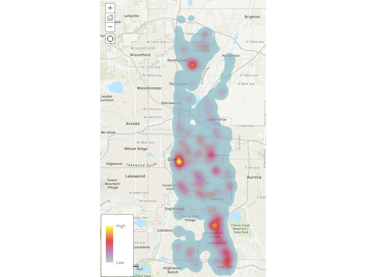
이제 모바일 기기의 광범위한 공간 패턴을 이해했으므로, 인간 활동 패턴에 대한 더 깊은 통찰력을 어떻게 얻을 수 있을까요? 사람들은 어디에서 시간을 보낼까요? 이를 답하기 위해 FindDwellLocations를 사용하여 2019년 5월 31일(금요일)에 같은 일반 위치에서 최소 5분 동안 머문 덴버, CO의 기기를 찾았습니다. 이 분석은 일반적인 이동 활동과 구별되는, 더 오래 지속되는 활동이 있는 위치, 즉 소비자 목적지를 이해하는 데 도움이 될 수 있습니다.
result_dwell 데이터프레임은 다양한 위치에 머문 기기 또는 개인에 대한 정보를 제공합니다. 그림 4의 체류 시간 히트맵은 사람들이 덴버 주변에서 시간을 보내는 곳에 대한 개요를 제공합니다.

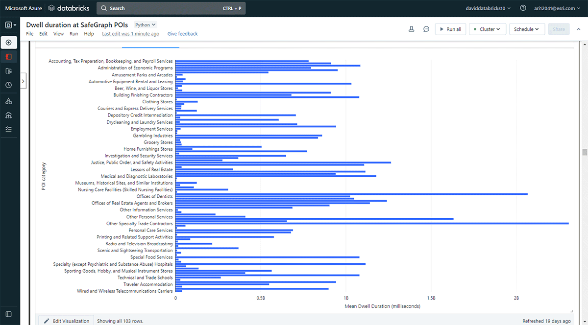
또한 더 오래 머무는 장소를 탐색하고 싶었습니다. 이를 달성하기 위해 Overlay를 사용하여 SafeGraph Geometry 데이터의 관심 지점(POI) 발자국 중 2019년 5월 31일에 체류 위치(result_dwell 데이터프레임에서)와 교차하는 지점을 식별했습니다. groupBy 함수를 사용하여 상위 POI 범주별로 연결된 기기 체류 시간을 계산했습니다. 그림 5는 사무용품, 문구 및 선물 가게, 무역 계약업체 사무실을 포함한 일부 도시 POI가 더 긴 체류 시간과 일치했음을 강조합니다.

Cell AnalyticsTM 데이터를 사용한 이 샘플 분석 워크플로는 사람들의 활동을 더 구체적으로 특징화하기 위해 적용하거나 재활용될 수 있습니다. 예를 들어, 소매점 주변의 소비자 행동에 대한 통찰력을 얻기 위해 데이터를 활용할 수 있습니다. 월마트나 코스트코에서 쇼핑한 후 어떤 레스토랑이나 커피숍을 방문했을까요? 또한 이러한 데이터셋은 팬데믹 및 자연 재해 관리에 유용할 수 있습니다. 예를 들어, 팬데믹 기간 동안 사람들이 공중 보건 비상 지침을 따랐을까요? 어떤 도시 지역이 다음 COVID-19 또는 산불로 인한 대기 질 악화 핫스팟이 될 수 있을까요? 소득 불평등으로 인한 인간 이동성 및 활동의 격차를 더 넓은 지리적 규모에서 볼 수 있을까요?
Transaction data analytics
관심 지점에 대한 집계된 거래 데이터에는 특정 위치에서 사람들이 돈을 어떻게, 언제 쓰는지에 대한 풍부한 정보가 포함되어 있습니다. 이러한 데이터의 엄청난 양과 속도는 소비자 지출 행동을 명확하게 이해하기 위해 고급 공간 분석 도구를 필요로 합니다: 지리적으로 소비자 행동은 어떻게 다를까요? 어떤 비즈니스가 수익성을 위해 함께 입지하는 경향이 있을까요? 물리적 매장(예: 월마트)에서 소비자는 어떤 상품을 구매하는 반면 온라인에서는 어떤 상품을 구매할까요? COVID-19와 같은 극한 상황에서 소비자 행동이 변할까요?
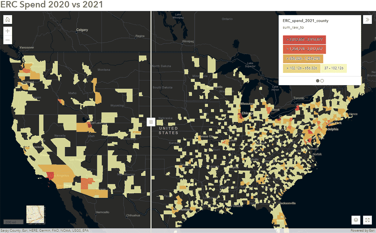
이러한 질문은 SafeGraph Spend 데이터와 GeoAnalytics Engine을 사용하여 답할 수 있습니다. 예를 들어, 2020년과 2021년의 전국 SafeGraph Spend 데이터를 분석하여 미국에서 COVID-19 동안 사람들의 이동 패턴이 어떻게 영향을 받았는지 파악하고자 했습니다. 아래에서는 미국 카운티별로 집계된 기업 렌터카에 대한 소비자 연간 지출(USD)을 보여줍니다. 데이터프레임을 ArcGIS Online에 게시한 후, ArcGIS Web AppBuilder의 Swipe 위젯을 사용하여 대화형 지도를 만들어 시간에 따른 변화를 보인 카운티를 빠르게 탐색했습니다(그림 6).

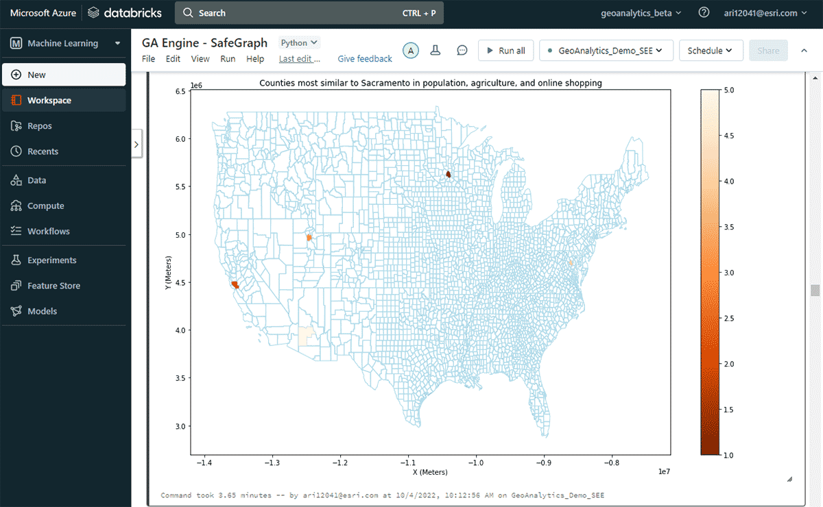
다음으로, 연간 온라인 지출이 가장 많은 미국 카운티는 어디인지, 그리고 인구 및 농산물 판매 패턴의 유사성을 고려하여 비슷한 온라인 쇼핑 지출 패턴을 가진 다른 카운티들을 탐색했습니다. 지출 DataFrame의 속성 필터링을 기반으로, 2020년에 새크라멘토가 온라인 쇼핑 지출에서 최고 순위를 차지했음을 확인했습니다. 유사한 지역을 찾기 위해 FindSimilarLocations 도구를 사용하여 온라인 쇼핑 및 지출 측면에서 새크라멘토와 가장 유사하거나 다른 카운티를 식별했습니다. 이는 인구 및 농업(총 경작지 면적 및 농산물 평균 판매량)의 유사성과 관련이 있습니다(그림 7).

공공 서비스 데이터 분석
311 민원 기록과 같은 공공 서비스 데이터셋에는 주민들에게 제공되는 비응급 서비스에 대한 귀중한 정보가 포함되어 있습니다. 이 데이터에서 시공간적 패턴을 시기적절하게 모니터링하고 식별하면 지방 정부가 효율적인 311 민원 처리를 위한 리소스를 계획하고 할당하는 데 도움이 될 수 있습니다.
이 예시에서는 2010년부터 2022년 2월까지의 뉴욕 311 서비스 요청 약 2,700만 건의 데이터를 신속하게 읽고, 처리/정제하고, 필터링한 다음, 뉴욕시 지역에 대한 다음 질문에 답하는 것을 목표로 했습니다:
- 평균 311 응답 시간이 가장 긴 지역은 어디인가요?
- 평균 응답 시간이 긴 불만 유형에 패턴이 있나요?
첫 번째 질문에 답하기 위해 응답 시간이 가장 긴 민원을 식별했습니다. 다음으로, 평균 지속 시간의 3 표준편차를 초과하는 기록을 포함하도록 데이터를 필터링했습니다.
두 번째 질문인 중요한 민원 그룹 찾기에 답하기 위해 GroupByProximity 도구를 활용하여 500피트 및 5일 이내에 있는 동일 유형의 민원을 찾았습니다. 그런 다음 10개 이상의 기록이 있는 그룹을 필터링하고 각 민원 그룹에 대한 볼록 헐(convex hull)을 생성했습니다. 이는 공간 패턴 시각화에 유용할 것입니다(그림 8). ArcGIS GeoAnalytics Engine에 포함된 경량 플로팅 메서드인 st.plot()을 사용하면 DataFrame에 저장된 지오메트리를 즉시 볼 수 있습니다.

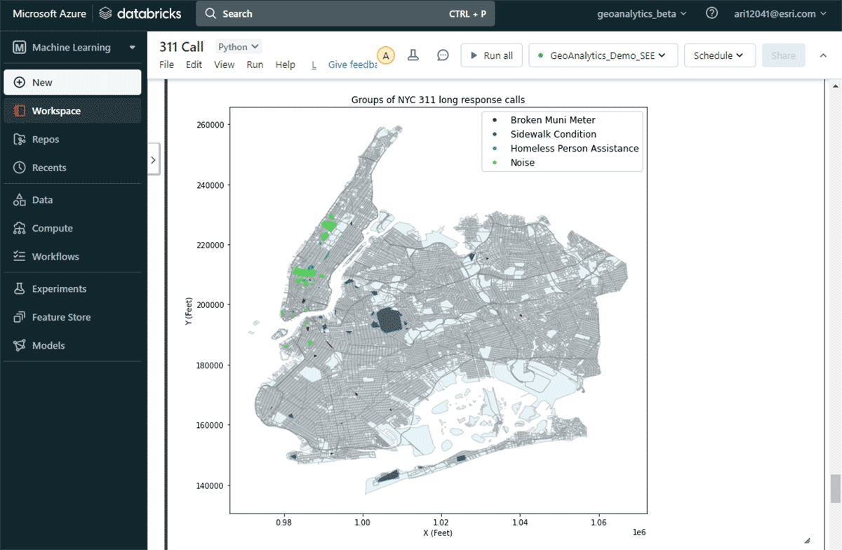
이 지도를 통해 뉴욕시의 다양한 민원 유형별 공간 분포를 쉽게 파악할 수 있었습니다. 예를 들어, 맨해튼 중하부 지역에는 소음 관련 민원이 상당수 집중된 반면, 브루클린과 퀸즈 지역에서는 보도 상태가 주요 관심사였습니다. 이러한 신속한 데이터 기반 통찰력은 의사결정권자들이 실행 가능한 조치를 취하는 데 도움이 될 수 있습니다.
벤치마크
많은 고객이 분석 솔루션을 선택할 때 성능을 중��요한 요소로 고려합니다. Esri의 벤치마크 테스트에 따르면 GA Engine은 오픈소스 패키지에 비해 빅데이터 공간 분석 실행 시 훨씬 뛰어난 성능을 제공합니다. 데이터 크기가 커질수록 성능 향상이 증가하므로, 사용자는 더 큰 데이터셋에서 더욱 향상된 성능을 경험할 수 있습니다. 예를 들어, 아래 표는 다양한 크기의 두 입력 데이터셋(점과 폴리곤)을 조인하는 공간 교차 작업의 계산 시간을 보여줍니다. 각 조인 시나리오는 단일 및 다중 머신 Databricks 클러스터에서 테스트되었습니다.
| 공간 교차 입력 | 계산 시간 (초) | ||
|---|---|---|---|
| 왼쪽 데이터셋 | 오른쪽 데이터셋 | 단일 머신 | 다중 머신 |
| 폴리곤 50개 | 점 6천 개 | 6 | 5 |
| 폴리곤 3천 개 | 점 6천 개 | 10 | 5 |
| 폴리곤 3천 개 | 점 2백만 개 | 19 | 9 |
| 폴리곤 3천 개 | 점 1,700만 개 | 46 | 16 |
| 폴리곤 22만 개 | 점 1,700만 개 | 80 | 29 |
| 폴리곤 1,100만 개 | 점 1,700만 개 | 515 (8.6분) | 129 (2.1분) |
| 폴리곤 1,100만 개 | 점 1,900만 개 | 1,373 (22분) | 310 (5분) |
아키텍처 및 설치
마무리하기 전에 GeoAnalytics Engine 아키텍처의 내부를 살펴보고 작동 방식을 알아보겠습니다. 클라우드 네이티브이며 Spark 네이티브이기 때문에 클라우드 기반 Spark 환경에서 GeoAnalytics 라이브러리를 쉽게 사용할 수 있습니다. Databricks 환경에 GeoAnalytics Engine 배포를 설치하는 데는 최소한의 구성만 필요합니다. JAR 파일을 통해 모듈을 로드하면 클러스터에서 제공하는 리소스를 사용하여 실행됩니다.
설치는 AWS, Azure 및 GCP 전반에 적용되는 2가지 기본 단계로 이루어집니다.
- 작업 공간 준비
- Databricks 작업 공간 생성 �또는 시작
- GeoAnalytics JAR 파일을 DBFS에 업로드
- 초기화 스크립트 추가 및 활성화
- 클러스터 생성
설치 후 사용자는 Spark 환경에 연결된 Python 노트북을 사용하여 분석합니다. Databricks Lakehouse Platform 데이터에 즉시 액세스하여 분석을 수행할 수 있습니다. 분석 후에는 결과를 데이터 레이크, SQL Warehouse, BI(Business Intelligence) 서비스 또는 ArcGIS에 다시 기록하여 저장할 수 있습니다.
향후 계획
이 블로그에서는 Databricks에서의 ArcGIS GeoAnalytics Engine의 강력한 기능을 소개하고 가장 까다로운 지리 공간 사용 사례를 함께 해결하는 방법을 시연했습니다. 위에서 보여준 예제에 대한 자세한 내용은 이 Databricks Notebook을 참조하세요. 향후 GeoAnalytics Engine은 GeoJSON 내보내기, H3 빈 지원 및 K-최근접 이웃과 같은 클러스터링 알고리즘을 포함한 추가 기능으로 향상될 것입니다.
GeoAnalytics Engine은 Azure, AWS 및 GCP의 Databricks와 함께 작동합니다. 선호하는 Databricks 환경에 GeoAnalytics 라이브러리를 배포하는 방법에 대한 자세한 내용은 Databricks 및 Esri 계정 팀에 문의하세요. GeoAnalytics Engine에 대해 자세히 알아보고 이 강력한 제품에 액세스하는 방법을 알아보려면 Esri의 웹사이트를 방문하세요.
(이 글은 AI의 도움을 받아 번역되었습니다. 원문이 궁금하시다면 여기를 클릭해 주세요)
최신 게시물을 이메일로 받아보세요
블로그를 구독하고 최신 게시물을 이메일로 받아보세요.