ArcGIS GeoAnalytics Engine in Databricks
Scalable Geospatial Analysis in a Data Science Workflow
by Kent Marten and Arif Masrur
This is a collaborative post from Esri and Databricks. We thank Senior Solution Engineer Arif Masrur, Ph.D. at Esri for his contributions.
Advances in big data have enabled organizations across all industries to address critical scientific, societal, and business issues. Big data infrastructure development assists data analysts, engineers, and scientists address the core challenges of working with big data - volume, velocity, veracity, value, and variety. However, processing and analyzing massive geospatial data presents its own set of challenges. Every day, hundreds of exabytes of location-aware data are generated. These data sets contain a wide range of connections and complex relationships between real-world entities, necessitating advanced tooling capable of effectively binding these multifaceted relationships through optimized operations such as spatial and spatiotemporal joins. The numerous geospatial formats that must be ingested, verified and standardized for efficient scaled analysis add to the complexity.
Some of the difficulties of working with geographical data are addressed by the recently announced support for built-in H3 expressions in Databricks. However, there are many geospatial use cases, some of which are more complex or centered on geometry rather than grid indices. Users can work with a range of tools and libraries on the Databricks platform while taking advantage of numerous Lakehouse capabilities.
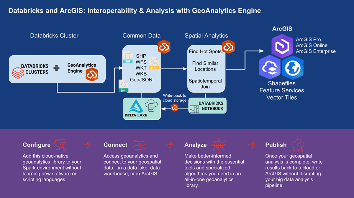
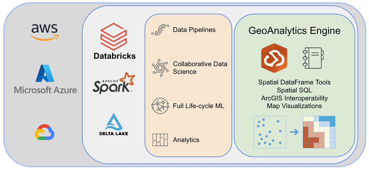
Esri, the world's leading GIS software vendor, offers a comprehensive set of tools, including ArcGIS Enterprise, ArcGIS Pro, and ArcGIS Online, to solve the aforementioned geo-analytics challenges. Organizations and data practitioners using Databricks need access to tools where they do their day-to-day work outside of the ArcGIS environment. This is why we are excited to announce the first release of ArcGIS GeoAnalytics Engine (hereafter called GA Engine), which allows data scientists, engineers, and analysts to analyze their geospatial data within their existing big data analysis environments. Specifically, this engine is a plugin for Apache Spark™ that extends data frames with very fast spatial processing and analytics, ready to run in Databricks.
Benefits of the ArcGIS GeoAnalytics Engine
Esri's GA Engine allows data scientists to access geoanalytical functions and tools within their Databricks environment. The key features of GA Engine are:
- 120+ spatial SQL functions—Create geometries, test spatial relationships, and more using Python or SQL syntax
- Powerful analysis tools—Run common spatiotemporal and statistical analysis workflows with only a few lines of code
- Automatic spatial indexing—Perform optimized spatial joins and other operations immediately
- Interoperability with common GIS data sources —Load and save data from shapefiles, feature services, and vector tiles
- Cloud-native and Spark-native—Tested and ready to install on Databricks
- Easy to use—Build spatially-enabled big data pipelines with an intuitive Python API that extends PySpark
SQL functions and analysis tools
Currently GA Engine provides 120+ SQL functions and 15+ spatial analysis tools that support advanced spatial and spatiotemporal analysis. Essentially, GA Engine functions extend the Spark SQL API by enabling spatial queries on DataFrame columns. These functions can be called with Python functions or in a PySpark SQL query statement and enable creating geometries, operating on geometries, evaluating spatial relationships, summarizing geometries, and more. In contrast to SQL functions which operate on a row-by-row basis using one or two columns, GA Engine tools are aware of all columns in a DataFrame and use all rows to compute a result if required. These wide arrays of analysis tools enable you to manage, enrich, summarize, or analyze entire datasets.
|
|
The GA Engine is a powerful analytical tool. Not to be overshadowed, though, is how easy the GA Engine makes working with common GIS formats. The GA Engine documentation includes multiple tutorials for reading and writing to and from Shapefiles and Feature Services. The ability to process geospatial data using GIS formats provides great interoperability between Databricks and Esri products.
GA engine for different use cases
Let's go over a few use scenarios from various industries to show how the ESRI's GA Engine handles large amounts of spatial data. Support for scalable spatial and spatiotemporal analysis is intended to assist any company in making critical decisions. In three diverse data analytics domains—mobility, consumer transaction, and public service—we will concentrate on revealing geographical insights.
Mobility data analytics
Mobility data is constantly growing and can be divided into two categories: human movement and vehicle movement. Human mobility data collected from smartphone users in mobile phone service areas provide a more in-depth look at human activity patterns. Millions of connected vehicles' movement data provide rich real-time information on directional traffic volumes, traffic flows, average speeds, congestion, and more. These data sets are typically large (billions of records) and complex (hundreds of attributes). These data require spatial and spatiotemporal analysis that goes beyond basic spatial analysis, with immediate access to advanced statistical tools and specialized geoanalytics functions.
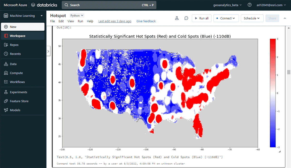
Let's start by looking at an example of analyzing human movement based on Cell Analytics™ data from Esri partner Ookla®. Ookla® collects big data on global wireless service performance, coverage, and signal measurements based on the Speedtest® application. The data includes information about the source device, mobile network connectivity, location, and timestamp. In this case, we worked with a subset of data containing approximately 16 billion records. With tools not optimized for parallel operations in Apache Spark(™), reading this high-volume data and enabling it for spatiotemporal operations could incur hours of processing time. Using a single line of code with GeoAnalytics Engine, this data can be ingested from parquet files in a few seconds.
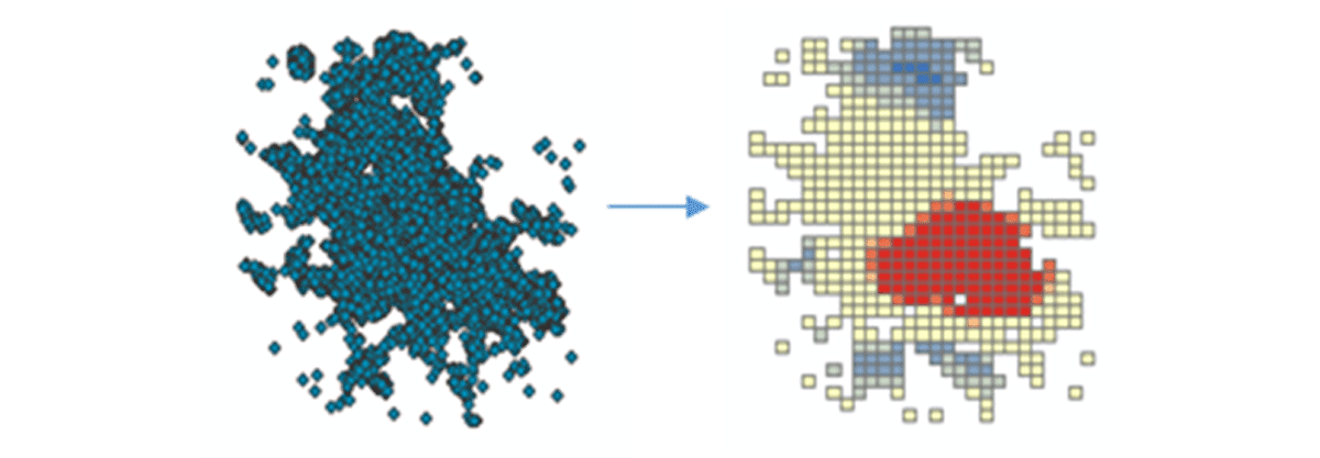
To start deriving actionable insights, we'll dive into the data with a simple question: What is the spatial pattern of mobile devices over the conterminous United States? This will allow us to begin characterizing human presence and activity. The FindHotSpots tool can be used to identify statistically significant spatial clusters of high values (hot spots) and low values (cold spots).
The resulting DataFrame of hot spots was visualized and styled using Matplotlib (Figure 2). It showed many records of device connections (red) compared to locations with low density of connected devices (blue) in the conterminous United States. Unsurprisingly, major urban areas indicated a higher density of connected devices.
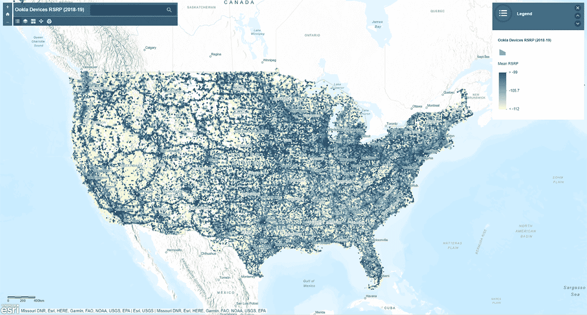
Next, we asked, does mobile network signal strength follow a homogeneous pattern across the United States? To answer that, the AggregatePoints tool was used to summarize device observations into hexagonal bins to identify areas with particularly strong and particularly weak cellular service (Figure 3). We used rsrp (reference signal received power) – a value used to measure mobile network signal strength – to calculate the mean statistic over 15km bins. This analysis illuminated that cellular service signal strength is not consistent - instead it tends to be stronger along the major road networks and urban areas.
In addition to plotting the result using st_plotting, we used the arcgis module, published the resulting DataFrame as a feature layer in ArcGIS Online, and created a map-based, interactive visualization.
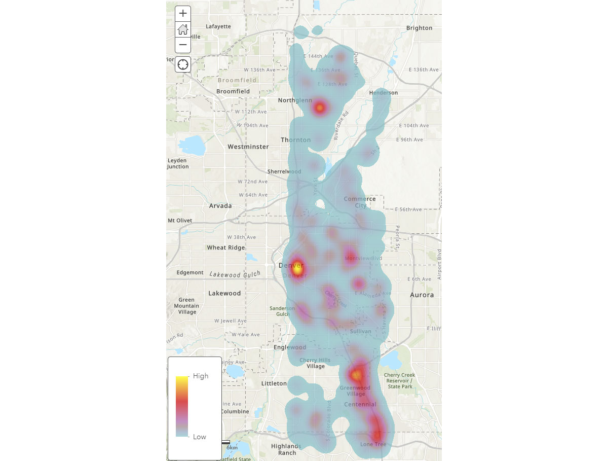
Now that we understand the broad spatial patterns of mobile devices, how can we gain deeper insight into human activity patterns? Where do people spend time? To answer that, we used FindDwellLocations to look for devices in Denver, CO that spent at least 5 minutes in the same general location on May 31, 2019 (Friday). This analysis can help us understand locations with more prolonged activity, i.e., consumer destinations, and separate these from general travel activity.
The result_dwell data frame provides us with devices or individuals that dwelled at different locations. The dwell duration heatmap in Figure 4 provides an overview about where people spend their time around Denver.
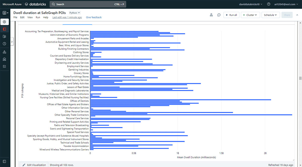
We also wanted to explore the locations people visit for longer durations. To accomplish that, we used Overlay to identify which points-of-interest (POI) footprints from SafeGraph Geometry data intersected with dwell locations (from result_dwell DataFrame) on May 31, 2019. Using groupBy function, we counted the connected device dwell times for each of the top POI categories. Figure 5 highlights that a few urban POIs in Denver coincided with longer dwell times including office supplies, stationery and gift stores, and offices of trade contractors.
This sample analytical workflow with Cell AnalyticsTM data could be applied or repurposed to characterize people's activities more specifically. For example, we could utilize the data to gain insights into consumer behavior around retail locations. Which restaurants or coffee shops did these devices or individuals visit after shopping at Walmart or Costco? Additionally, these datasets can be useful for managing pandemics and natural disasters. For example, do people follow public health emergency guidelines during a pandemic? Which urban locations could be the next COVID-19 or wildfire-induced poor air quality hot spots? Do we see disparities in human mobilities and activities due to income inequality at a broader geographic scale?
Transaction data analytics
Aggregated transaction data over points of interest contains rich information about how and when people spend their money at specific locations. The sheer volume and velocity of these data require advanced spatial analytical tools to understand consumer spending behavior clearly: How does consumer behavior differ by geography? What businesses tend to co-locate to be profitable? What merchandise do consumers buy at a physical store (e.g., Walmart) compared to the products they purchase online? Does consumer behavior change during extreme events such as COVID-19?
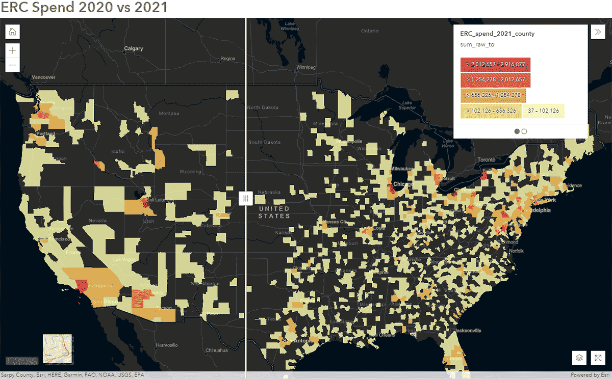
These questions can be answered using SafeGraph Spend data and GeoAnalytics Engine. For instance, we wanted to identify how people's travel patterns were impacted during COVID-19 in the United States. To accomplish that, we analyzed nationwide SafeGraph Spend data from 2020 and 2021. Below, we show yearly spend (USD) by consumers for enterprise rental cars, aggregated to U.S. counties. After publishing the DataFrame to ArcGIS Online, we created an interactive map using the Swipe widget from ArcGIS Web AppBuilder to quickly explore which counties showed change over time (Figure 6).
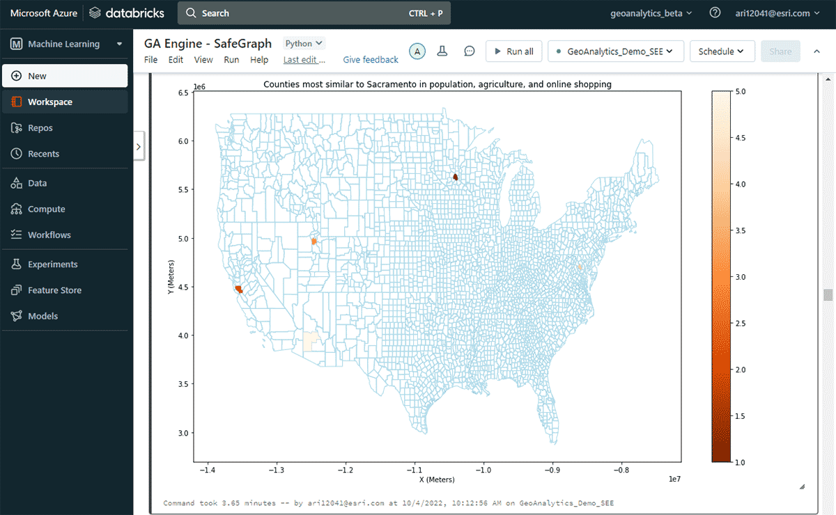
Next, we explored which U.S. county had the highest online spend in a year and other counties with similar online-shopping spending patterns considering similarities in population and agricultural product sale patterns. Based on attribute filtering of the spend DataFrame, we identified that Sacramento topped the list in online-shopping spending in 2020. To look at similar areas, we used FindSimilarLocations tool to identify counties that are most similar or dissimilar to Sacramento in terms of online shopping and spending but relative to similarities in population and agriculture (total area of cropland and average sales of agricultural products) (Figure 7).
Public service data analytics
Public service datasets, such as 311 call records, contain valuable information on non-emergency services provided to residents. Timely monitoring and identification of spatiotemporal patterns in this data can help local governments plan and allocate resources for efficient 311 call resolution.
In this example, our goal was to quickly read, process/clean, and filter ~27 million records of New York 311 service requests from 2010 to February of 2022, and then answer the following for the New York City area questions:
- What are the areas with the longest average 311 response times?
- Are there patterns in complaint types with long average response times?
To answer the first question, the calls with the longest response times were identified. Next, the data was filtered to include records longer than the mean duration plus three standard deviations.
To answer the second question of finding significant groups of complaints, we leveraged the GroupByProximity tool to look for complaints of the same type that fell within 500 feet and 5 days of each other. We then filtered for groups with more than 10 records, and created a convex hull for each complaint group, which will be useful for visualizing their spatial patterns (Figure 8). Using st.plot() - a lightweight plotting method included with ArcGIS GeoAnalytics Engine - geometries stored in a DataFrame can instantly be viewed.
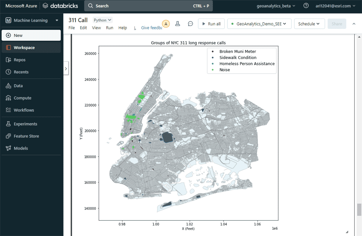
With this map, it was easy to identify the spatial distributions of different complaint types in New York City. For instance, there were a considerable number of noise complaints around the mid- and lower-Manhattan areas, whereas sidewalk conditions are of major concern around Brooklyn and Queens. These quick data-driven insights can help decision-makers initiate actionable measures.
Benchmarks
Performance is a deciding factor for many customers trying to choose an analysis solution. Esri's benchmark testing has shown that GA Engine provides significantly better performance when running big data spatial analytics compared to open-source packages. The performance gains increase as the data size increases, so users will see even better performance for larger datasets. For example, the table below shows compute times for a spatial intersection task that joins two input datasets (points and polygons) with varied sizes up to millions of data records. Each join scenario was tested on a single and multi-machine Databricks cluster.
| Spatial Intersection Inputs | Compute Time (seconds) | ||
|---|---|---|---|
| Left Dataset | Right Dataset | Single Machine | Multi-Machine |
| 50 polygons | 6K points | 6 | 5 |
| 3K polygons | 6K points | 10 | 5 |
| 3K polygons | 2M points | 19 | 9 |
| 3K polygons | 17M points | 46 | 16 |
| 220K polygons | 17M points | 80 | 29 |
| 11M polygons | 17M points | 515 (8.6 min) | 129 (2.1 min) |
| 11M polygons | 19M points | 1,373 (22 min) | 310 (5 min) |
Architecture and Installation
Before wrapping up, let's take a peek under the hood of the GeoAnalytics Engine architecture and explore how it works. Because it is cloud-native and Spark-native, we can easily use the GeoAnalytics library in a cloud-based Spark environment. Installing the GeoAnalytics Engine deployment in Databricks environment requires minimal configuration. You'll load in the module via a JAR file, and it then runs using the resources provided by the cluster.
Installation has 2 basic steps which apply across AWS, Azure, and GCP:
- Prepare the workspace
- Create or launch a Databricks workspace
- Upload the GeoAnalytics jar file to the DBFS
- Add and enable an init script
- Create a cluster
Following the installation, users will analyze using a Python notebook attached to the Spark environment. You can instantly access Databricks Lakehouse Platform data and perform analysis. Following the analysis, you can persist the results by writing them back to your data lake, SQL Warehouse, BI (Business Intelligence) services, or ArcGIS.
Road ahead
In this blog, we have introduced the power of the ArcGIS GeoAnalytics Engine on Databricks and demonstrated how we can tackle the most challenging geospatial use cases together. Refer to this Databricks Notebook for detailed reference of the examples shown above. Going forward, GeoAnalytics Engine will be enhanced with additional functionality including GeoJSON export, H3 binning support, and clustering algorithms such as K-Nearest Neighbor.
GeoAnalytics Engine works with Databricks on Azure, AWS, and GCP. Please reach out to your Databricks and Esri account teams for details about deploying the GeoAnalytics library in your preferred Databricks environment. To learn more about GeoAnalytics Engine and explore how to gain access to this powerful product, please visit Esri's website.
Get the latest posts in your inbox
Subscribe to our blog and get the latest posts delivered to your inbox.