Cos'è il Data Storytelling?
Combina analisi dei dati, visualizzazione e tecniche narrative per comunicare informazioni che guidano l'azione e il processo decisionale
- Comprendere cos'è il Data Storytelling e come trasforma i dati grezzi in narrazioni coinvolgenti che trovano riscontro nel pubblico.
- Scoprire i componenti dello storytelling, tra cui l'impostazione del contesto, la progettazione della visualizzazione e la creazione di messaggi chiari.
- Esplorare le tecniche per strutturare le storie basate sui dati, scegliere grafici appropriati e adattare i messaggi ai diversi gruppi di stakeholder.
Definizione di data storytelling
Lo storytelling dei dati è la pratica di combinare dati, visualizzazioni e una narrazione per comunicare approfondimenti basati sui dati in modo chiaro e di forte impatto. Invece di presentare semplicemente i numeri da soli, lo storytelling dei dati li inserisce in un contesto che spiega cosa ci dicono i dati e perché potrebbe essere importante, così come, forse, cosa aspettarsi in futuro e quali azioni potrebbero essere consigliate di conseguenza.
Il vantaggio della narrazione dei dati è la sua capacità di rendere le informazioni complesse più facili da capire e, se pertinente, più attuabili. Molte organizzazioni raccolgono grandi quantità di dati, ma i dati grezzi o i grafici da soli sono in genere più utili per le persone con una formazione specializzata in statistica o campi correlati. La narrazione dei dati traduce analisi sofisticate in una forma che può essere ampiamente compresa da un pubblico più generico. Una narrazione dei dati ben realizzata evidenzia i risultati più importanti, li spiega in un linguaggio semplice e visualizza pattern o tendenze per renderli più facili da identificare. Questo a sua volta rende più facile per i team utilizzare più dati in modo più efficace per guidare le loro decisioni, risolvere i problemi, anticipare i rischi e identificare le opportunità.
Lo storytelling dei dati si distingue da dashboard, reporting e analisi grezza in quanto questi ultimi in genere presentano i dati in un formato neutro e strutturato senza interpretazione. Mostrano quali sono i numeri, ma non necessariamente il loro significato. Questo livello di analisi può essere piuttosto dettagliato e tecnico e spesso richiede conoscenze specialistiche per essere compreso. Lo storytelling dei dati, al contrario, si concentra sulla chiarezza e sul significato. Seleziona i dati più pertinenti, aggiunge contesto e utilizza tecniche narrative per guidare il pubblico verso la conoscenza. In questo modo, lo storytelling dei dati è progettato per trasformare le informazioni in comprensione e la comprensione in azione.
Perché lo storytelling dei dati è importante
Saper presentare una storia avvincente basata sui dati è importante perché aiuta le persone a cogliere rapidamente gli approfondimenti che altrimenti potrebbero essere nascosti in set di dati grandi o complessi. Invece di chiedere a qualcuno di interpretare da solo numeri grezzi o grafici densi, lo storytelling dei dati presenta quantità di informazioni gestibili in modo chiaro e coinvolgente, facendosi carico di gran parte del lavoro analitico. Ciò rende gli approfondimenti più accessibili a un pubblico non tecnico e supporta un processo decisionale più solido e sicuro all'interno di un'organizzazione.
Il data storytelling migliora anche la comunicazione tra analisti e stakeholder creando una comprensione condivisa di ciò che i dati mostrano e del perché sia importante. Quando le informazioni dettagliate sono presentate sotto forma di storia, diventano più facili da ricordare e discutere e più utili per guidare le azioni.
Vantaggi per i decisori
Lo storytelling dei dati aiuta i responsabili delle decisioni a comprendere più rapidamente, evidenziando i risultati più importanti e rimuovendo la complessità non necessaria. Invece di analizzare dashboard o fogli di calcolo, i leader possono concentrarsi sul messaggio chiave.
Fornisce inoltre maggiore chiarezza sulle informazioni dettagliate, mostrando non solo cosa sta accadendo, ma perché sta accadendo e cosa significa per l'azienda. Questa chiarezza favorisce un maggiore allineamento degli stakeholder, garantendo che i team dei vari reparti interpretino i dati in modo coerente e procedano con una comprensione condivisa.
Vantaggi per i team di analitiche
Per i team di analitiche, il data storytelling viene utilizzato per promuovere una comunicazione più efficace dei risultati. Gli analisti possono presentare i risultati in un modo che sia di impatto per il pubblico non tecnico, aumentando la probabilità che le informazioni dettagliate vengano comprese e utilizzate. Questo crea un impatto maggiore, poiché è più probabile che le raccomandazioni influenzino le decisioni e spingano all'azione.
Lo storytelling dei dati aiuta anche gli analisti a separare i segnali presenti nei dati dal rumore, concentrando l'attenzione sui trend, i pattern e le relazioni più importanti. Guidando il pubblico attraverso i dati, i team di analisi possono garantire che le informazioni dettagliate critiche non vengano trascurate.
Nel complesso, lo storytelling dei dati rafforza la connessione tra dati e azione, aiutando le organizzazioni a prendere decisioni migliori, più rapide e più allineate.
Elementi chiave di una data story
Una data story efficace unisce informazioni, elementi visivi e narrazione in modo che il pubblico possa capire chiaramente il significato dei dati e perché sono importanti. Sebbene ogni storia sia diversa, le data story più efficaci condividono quattro elementi fondamentali:
- Contesto
- Conflitto
- Risoluzione
- Una call-to-action
Questi elementi si combinano per formare una struttura narrativa familiare che facilita al lettore la comprensione della relazione tra gli approfondimenti e i dati, semplificando l'analisi di informazioni complesse e la memorizzazione degli approfondimenti.
Contesto
Il contesto di una storia basata sui dati fornisce ai lettori le informazioni di base necessarie per interpretare i dati. Spiega cosa rappresentano i dati, da dove provengono e perché vengono analizzati. Un contesto chiaro aiuta il pubblico a concentrarsi e a circoscrivere il proprio pensiero all'interno dell'ambito della storia che i dati stanno cercando di raccontare. Il contesto prepara inoltre il terreno per il resto della storia, fornendo al pubblico le basi di cui ha bisogno prima di esplorare i risultati.
Le parti chiave del contesto possono includere:
- Il problema di business o la domanda a cui i dati rispondono
- L'arco temporale o l'ambito
- Il pubblico o gli stakeholder coinvolti
Conflitto
Conflitto è un termine narrativo che, nel contesto dei dati, si riferisce all'approfondimento, al problema, alla tendenza o alla scoperta inaspettata che emerge dai dati. È il punto di svolta della storia che cattura l'attenzione e mostra perché i dati sono importanti. Il conflitto potrebbe rivelare un pattern sorprendente, un divario di prestazioni, un rischio in aumento o un'opportunità che non era precedentemente visibile. Altri esempi specifici includono:
- Un calo improvviso della soddisfazione del cliente
- Una tendenza che contraddice le aspettative
- Un divario tra gli obiettivi e la performance effettiva
L'elemento di conflitto dà slancio alla data story evidenziando la tensione che deve essere affrontata o un'azione che deve essere intrapresa.
Risoluzione
L'elemento di risoluzione spiega le informazioni emerse dall'analisi completa dei dati. Chiarisce il significato alla base del conflitto e mostra come l'approfondimento si inserisce nel quadro più ampio. Questa parte della storia aiuta il pubblico a comprendere la causa principale, le implicazioni o le relazioni emerse nell'analisi. La Risoluzione è la parte dello storytelling che trasforma i risultati grezzi in una comprensione più chiara.
Invito all'azione
L'invito all'azione identifica la decisione, l'azione o il passo successivo supportato dall'approfondimento. Collega la storia dei dati a risultati reali, spiegando cosa dovrebbe accadere dopo. Una forte call-to-action è specifica, pratica e in linea con il problema aziendale o la domanda originale a cui i dati rispondono, nonché con le esigenze del pubblico. Ciò garantisce che la storia porti a un'azione significativa, invece di presentare semplicemente informazioni fini a se stesse.
Framework di data storytelling
Una tecnica di storytelling utile è quella di usare un framework per fornire una struttura narrativa e aiutare a trasformare le analisi in contenuti chiari e coinvolgenti, che indicano come organizzare le informazioni, come rivelare gli approfondimenti e come guidare il pubblico verso la comprensione e l'azione. Di seguito sono riportati alcuni dei framework più comuni, solitamente utilizzati per aiutare i data storyteller a organizzare le informazioni, a progettare elementi visivi e a guidare il pubblico in modo chiaro e coinvolgente.
Le cinque fasi dello storytelling
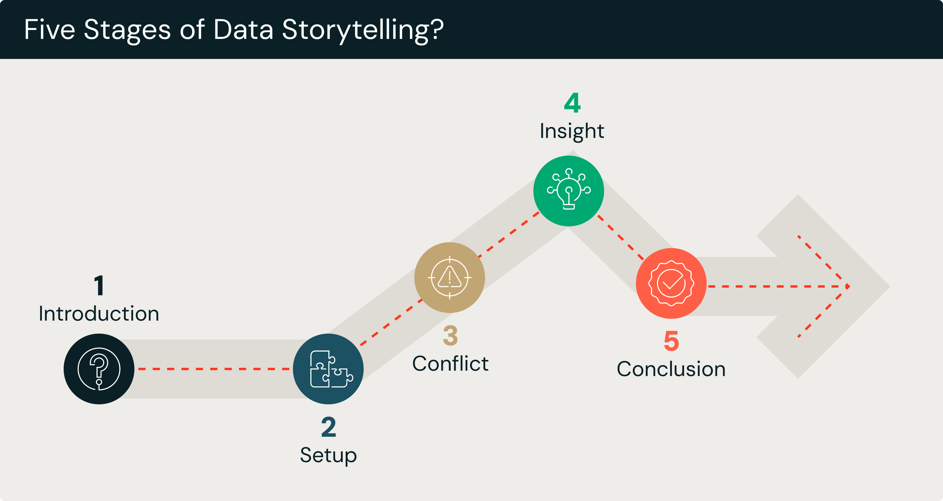
Un framework che può aiutarti a visualizzare il flusso di una storia basata sui dati e a darle una struttura narrativa consiste nel pensarla come una sequenza in cinque fasi:
- Introduzione: espone brevemente l'argomento o la domanda che i dati affronteranno.
- Premessa: fornisce le informazioni di base, il contesto e i dati necessari per comprendere la situazione.
- Conflitto: evidenzia l'approfondimento chiave, la sfida o il pattern inaspettato scoperto nei dati.
- Approfondimento: spiega cosa significa il conflitto e perché è importante.
- Conclusione: riassume il messaggio chiave e prepara il pubblico ai passi successivi.
Questa semplice progressione si allinea al modo in cui le persone elaborano naturalmente le informazioni, rendendo più facile per il pubblico seguire la storia dall'inizio alla fine.
Le quattro P dello storytelling
Anziché una sequenza di elementi narrativi, questo framework si concentra sui componenti principali che danno forma a una storia, ovvero le quattro P: persone, luogo, trama e scopo:
- Persone: descrive chi è interessato dall'approfondimento o coinvolto nella situazione.
- Luogo: descrive l'ambiente, il settore aziendale o il contesto in cui si applicano i dati.
- Trama: presenta la sequenza di eventi o le tendenze mostrate nei dati.
- Scopo: spiega il motivo per cui la storia viene raccontata e il risultato che supporta.
Per alcune storie basate sui dati, questo framework può fornire chiarezza concentrando la struttura della storia su queste categorie separate anziché integrarle in una narrazione sequenziale, come nel framework precedente.
Le cinque C della visualizzazione dei dati
Elementi visivi efficaci sono una parte essenziale della narrazione dei dati e le Cinque C offrono una semplice checklist per creare grafici e diagrammi efficaci:
- Chiarezza: assicurati che gli elementi visivi siano facili da leggere e da capire.
- Contesto: utilizzare etichette, scale e spiegazioni che aiutino il pubblico a interpretare correttamente i dati.
- Coerenza: utilizzare stili, colori e formati simili in tutti gli elementi visivi.
- Confronto: mostra chiaramente differenze, tendenze o relazioni.
- Scelte di colore/design: usa il colore intenzionalmente per evidenziare i punti chiave, ma fai attenzione a non sopraffare l'osservatore.
Il playbook sull'AI agentiva per l'enterprise

Il ruolo della visualizzazione dei dati nello storytelling
La visualizzazione dei dati svolge un ruolo centrale nello storytelling dei dati presentando i dati in modi che il cervello umano può interpretare più facilmente rispetto a testo o numeri. Pertanto, le visualizzazioni mostrano rapidamente ai lettori i pattern, le tendenze e le relazioni tra le serie di dati che altrimenti potrebbero essere difficili da capire. Se usate in modo efficace, le visualizzazioni come grafici e diagrammi aiutano i lettori a concentrarsi sulle informazioni dettagliate più importanti e a evitare di perdersi nei dettagli.
È importante notare, tuttavia, che le visualizzazioni fini a sé stesse non garantiscono necessariamente di avere una storia forte. Ciò deriva da un buon allineamento tra la narrazione e le visualizzazioni utilizzate. Mentre la narrazione spiega cosa il pubblico dovrebbe notare, gli elementi visivi rafforzano quel messaggio evidenziando le prove chiave.
Quando questi elementi funzionano insieme, la storia diventa più chiara, più coinvolgente e più facile da ricordare. Tuttavia, se un grafico evidenzia una tendenza mentre il testo ne discute un'altra, la storia può diventare confusionaria e perdere di impatto.
Tecniche di visualizzazione comuni
Diversi tipi di visualizzazioni supportano diversi tipi di informazioni dettagliate. Alcune delle tecniche più comuni includono:
- Grafici a linee per mostrare i cambiamenti nel tempo, rendendo facile l'individuazione di trend e pattern.
- Grafici a barre per confrontare categorie o gruppi in modo chiaro ed efficiente.
- Grafici a dispersione per rivelare relazioni o correlazioni tra due variabili.
- Mappe di calore che utilizzano il colore per evidenziare l'intensità, la frequenza o la concentrazione all'interno di un set di dati.
- Infografiche che combinano elementi visivi, icone e testi brevi per comunicare informazioni dettagliate in un formato molto coinvolgente e di facile consultazione.
Scegliere la visualizzazione corretta per l'approfondimento che si vuole evidenziare è importante per garantire che venga utilizzata in modo efficace.
Quando le dashboard non bastano
Tieni presente che le dashboard e le data story hanno scopi diversi.
I dashboard monitorano. Forniscono informazioni in tempo reale o aggiornate regolarmente, in modo che gli utenti possano monitorare le prestazioni, tracciare le metriche o individuare anomalie. Le dashboard sono eccellenti per l'osservazione continua, ma in genere non spiegano perché sta accadendo qualcosa.
Le storie spiegano, persuadono, guidano. Invece del monitoraggio continuo, il data storytelling di solito si concentra su un'istantanea dei dati relativa a un breve periodo di tempo o su una prospettiva storica più lunga. Inoltre, il suo obiettivo è interpretare i dati, evidenziare le informazioni dettagliate chiave e spiegare cosa significano. Lo storytelling aiuta il pubblico a capire il senso che si cela dietro ai numeri e lo guida verso un'azione o una decisione consigliata.
Le dashboard e le storie si completano a vicenda ed entrambe possono includere visualizzazioni, ma non sono intercambiabili. Il data storytelling utilizza la visualizzazione non solo per presentare i dati in modo chiaro, ma anche per rendere le implicazioni che ne derivano chiare e attuabili.
Come funziona il data storytelling
L'idea alla base della narrazione dei dati è trasformare i dati grezzi in una narrazione chiara e significativa che aiuti il pubblico di destinazione a capire cosa mostrano i dati e perché questo è importante. Prima che la storia inizi, tuttavia, è necessario condurre un'analisi dei set di dati in questione per identificare pattern e cercare approfondimenti. Successivamente, il narratore seleziona gli approfondimenti che desidera presentare come fulcro della storia.
Per mantenere una narrazione coerente, è importante scegliere approfondimenti pertinenti al problema o alla domanda aziendale che è all'origine della necessità di fare storytelling. Assicurati inoltre di allineare il messaggio generale o la conclusione con ciò di cui il pubblico ha bisogno per agire o prendere una decisione in merito al problema o alla domanda aziendale.
Trasformare l'analisi in una narrazione
Questa fase dello storytelling dei dati inizia con l'identificazione della conoscenza chiave, ovvero il risultato più importante che il pubblico deve comprendere. Quindi, lo storyteller può filtrare tutti i dettagli che non supportano il messaggio centrale. Questo passaggio è essenziale perché i dati spesso contengono molte più informazioni di quelle di cui il pubblico ha bisogno.
Infine, lo storyteller dovrebbe collegare i risultati al mondo reale. Invece di presentare i numeri in modo isolato, lo storyteller può spiegare perché la conoscenza è importante, in che modo influisce sugli obiettivi o sulle performance aziendali e cosa rivela sul soggetto dei dati. Passando dall'approfondimento al significato, la narrazione diventa più di un semplice riassunto. Fornisce una spiegazione chiara che aiuta il pubblico a comprendere le implicazioni dell'analisi.
Adattamento a pubblici diversi
Una narrazione efficace dei dati richiede anche di adattare il messaggio alle esigenze di pubblici diversi. I dirigenti in genere desiderano conclusioni di alto livello che supportino le decisioni, quindi la storia dovrebbe essere concisa e incentrata sui risultati piuttosto che sui dettagli tecnici. Analisti e colleghi, d'altra parte, si aspettano spiegazioni più approfondite, elementi visivi di supporto e trasparenza sui metodi, il che significa che la storia può includere più contesto e dettagli. Nel frattempo, clienti e stakeholder esterni spesso necessitano di chiarezza e di un gergo minimo, oltre a un background sufficiente per capire perché la conoscenza è importante per loro.
Adattando la profondità, il linguaggio e il focus della storia a ogni pubblico, il messaggio risulterà più incisivo e contribuirà a garantire che i destinatari possano agire con sicurezza sulla base degli approfondimenti della storia.
Esempi di storytelling dei dati
Un tipico grafico o grafico a torta, di per sé, può mostrare numeri o tendenze, ma senza una spiegazione spetta al lettore interpretarne il significato da solo. Aggiungendo narrazione e contesto, lo stesso grafico diventa molto più efficace. Invece di mostrare semplicemente una linea che sale o scende, la data story spiega perché è avvenuto il cambiamento, cosa significa per l'organizzazione e quali azioni potrebbero seguire. Trasformando i soli dati in un insieme di dati e narrazione, uno storyteller può trasformare le informazioni in conoscenza.
In ambito aziendale, la narrazione dei dati appare spesso in presentazioni che spiegano le performance trimestrali, le tendenze dei clienti o i risultati operativi. Le narrazioni di dati pubblici sono comuni nei rapporti governativi e di organizzazioni non profit che aiutano le comunità a comprendere argomenti come i cambiamenti demografici o le condizioni ambientali che possono sollevare questioni politiche o guidare le decisioni politiche. Per i team di analitiche, la narrazione dei dati li aiuta a presentare modelli complessi o risultati statistici in modo che un pubblico non tecnico possa comprenderli. Indipendentemente dall'applicazione, tuttavia, l'obiettivo è lo stesso: rendere i dati significativi, memorabili e utilizzabili per agire.
Esempi di tipi di scenario
Il data storytelling può essere utile in molti scenari comuni. Un Graph a linee dell'andamento delle prestazioni può diventare una storia di crescita, declino o stabilità nel tempo, aiutando i leader a capire non solo come cambiano i risultati, ma idealmente anche cosa sta guidando quel cambiamento. I dati grezzi sul comportamento dei clienti potrebbero diventare una storia che rivela modelli di acquisto, engagement o soddisfazione, trasformando dati inerti in una narrazione dinamica e coinvolgente che spinge all'azione per rispondere alle preferenze dei clienti. I problemi operativi presentati come data stories possono rivelare colli di bottiglia o inefficienze e mostrare dove sono necessari miglioramenti. Le data stories che spiegano i cambiamenti nella domanda, nella concorrenza o nei prezzi possono fornire informazioni dettagliate preziose sui cambiamenti del mercato.
Sebbene siano possibili molti scenari, in ogni caso è la narrazione che aiuta le persone a vedere non solo i dati, ma il significato che si cela dietro di essi.
Data storytelling a confronto con concetti simili
Il data storytelling è spesso confuso con la visualizzazione dei dati, le dashboard o il reporting, ma in realtà ha uno scopo distinto. Come già detto, mentre questi ultimi strumenti presentano le informazioni, il data storytelling ne spiega il significato. Un grafico o una dashboard possono mostrare dei numeri, ma senza contesto o interpretazione il pubblico deve capire il messaggio da solo. Lo storytelling colma questa lacuna guidando l'attenzione, chiarendo il significato e collegando le informazioni dettagliate a decisioni reali.
Circolano molte idee sbagliate sul data storytelling, in particolare l'idea che si tratti semplicemente di "creare grafici migliori" o "aggiungere testo a una dashboard". In realtà, lo storytelling è una disciplina della comunicazione e un'abilità importante. Non sostituisce le dashboard o i report, ma è piuttosto un metodo complementare utilizzato quando è importante raggiungere un pubblico specifico o generale e sono necessari una comprensione più profonda o un'azione.
Storytelling dei dati e visualizzazione dei dati
La visualizzazione dei dati in genere mostra i dati in diagrammi o grafici in modo che pattern e tendenze siano più facili da vedere. Il data storytelling spesso utilizza anche le visualizzazioni, ma include anche una narrazione per spiegare perché i dati sono importanti. Aggiunge contesto, interpretazione e struttura narrativa in modo che il pubblico ne colga il significato. Se la visualizzazione è uno strumento, lo storytelling è più una strategia di comunicazione che include la visualizzazione nella sua cassetta degli attrezzi.
Storytelling dei dati e reporting
La reportistica dei dati è pensata per condividere informazioni. Fornisce numeri, metriche e riepiloghi senza necessariamente interpretarli. Lo storytelling dei dati si spinge oltre, interpretando i dati e spiegandone le implicazioni. Un report potrebbe mostrare un calo delle vendite, ma una storia basata sui dati cerca di spiegare perché le vendite sono diminuite, quali fattori hanno contribuito e quali azioni dovrebbero essere prese in considerazione.
Conclusione
Combinando dati, elementi visivi e narrazione per spiegare il significato dei dati e il motivo per cui sono importanti, lo storytelling dei dati aiuta a trasformare le informazioni grezze in un messaggio chiaro che le persone possono comprendere e in base al quale possono agire. Invece di lasciare che il pubblico interpreti grafici o report da solo, lo storytelling dei dati può guidarlo verso le conoscenze, evidenziare ciò che è importante e collegare i risultati al contesto del mondo reale.
Anche se presentare i dati grezzi è molto importante, non è sempre l'approccio migliore, a seconda delle domande o dei problemi affrontati dai dati e del pubblico che si sta cercando di raggiungere. Lo storytelling dei dati può essere una parte importante di una comunicazione chiara e di un processo decisionale basato sui dati. Traducendo analisi complesse in una storia mirata e significativa, si garantisce che le informazioni dettagliate portino a scelte informate.
Pertanto, uno storytelling dei dati efficace può essere uno strumento aggiuntivo nel tuo toolkit per diffondere informazioni, promuovere la comprensione di tali informazioni e creare consenso verso specifiche linee d'azione.
Ricevi gli ultimi articoli nella tua casella di posta
Iscriviti al nostro blog e ricevi gli ultimi articoli direttamente nella tua casella di posta.