Building an A/B testing analysis framework for mobile gaming on Databricks
How HARDlight scaled experiment analytics with automated statistical modeling, governed insights, a daily-refresh dashboard, and LLM-generated summaries.
by Sanjay Ashok, Jack Holdsworth, Tingting Wan, Joel Dias, Richard Carr and Monika Kolodziejczyk
- From data to decisions: how Sega HARDlight automated A/B test analysis on Databricks through standardised experiment ingestion, statistical modelling, and result publication—reducing manual workflows and enabling a 2× increase in monthly experimentation capacity without additional headcount.
- Insights for every audience: daily-refresh monitoring with an LLM summary on top and progressively granular metrics, diagnostics, and recommended actions that democratize access to actionable insights across the organization.
- Trust through transparency: consistent statistical inference and accessible AI/BI views helped teams understand results, build confidence, and adopt a shared scientific approach to experimentation.
Introduction
Mobile game studios depend on continuous experimentation to refine gameplay, monetisation, and live operations. As experimentation scales, analysis often becomes the limiting factor. Results are often stitched together manually, statistical approaches vary by analyst, and insights arrive days after key signals emerge. Over time, this creates friction: slower iteration, inconsistent conclusions, and declining confidence in A/B testing as a reliable decision tool.
The Challenge
At HARDlight, the challenge was not just speed, but trust. Different approaches led to different interpretations, making alignment harder and weakening confidence in experimentation as a scientific decision tool. Some stakeholders needed a simple daily status, others wanted to understand player behaviour or business impact, and a smaller group required deep validation of specific game levers. The existing dashboards and reports struggled to serve this full spectrum of needs effectively. For experimentation to scale, HARDlight needed a way to standardise inference, make results accessible at different levels of depth, and rebuild trust in A/B testing as a shared, scientific decision process.
To address this, HARDlight built a Databricks-native A/B testing analysis framework that automates the path from experiment data to decision-ready insight. Statistical analysis was performed upstream in a repeatable, transparent way, and Databricks AI/BI surfaced the results through a daily-refresh experience that began with an LLM-generated summary and allows deeper exploration with progressively granular views. At the end of each experiment, results were frozen and preserved, ensuring decisions, context, and learnings remain available long after the test concludes.
The Solution: Automated A/B Testing on Databricks
HARDlight’s framework automates experimentation from ingestion through to decision support. Within Databricks, experiment definitions and telemetry are standardised, statistical modelling is applied consistently, and results are published to a layered dashboard that refreshes daily during the run window. An LLM summary at the top provides an accessible view of experiment status, while deeper sections expose KPIs, diagnostics, and recommended actions for expert users.
The choice of Databricks enables governance and repeatability across teams. Unity Catalog provides a single control plane for permissions and lineage of experiment assets; Spark Declarative Pipelines orchestrates reliable pipelines for experiment ingestion and transformations; and MLflow supports experiment tracking and model packaging for reproducible analysis. Together, these capabilities keep data and analytics governed, consistent and easy to operate in the Lakehouse.
A key innovation is the “frozen dashboard” at the end of the run. Instead of rolling on to the next refresh, the framework preserves the final snapshot and the decisions taken, along with recommended actions. This institutionalises learnings from past experiments and allows stakeholders to revisit outcomes without ambiguity.
Technical Architecture
The experimentation framework is built as a Databricks-native system that separates data processing, statistical inference, and consumption, while keeping all outputs governed and reproducible by default. This design ensures analytical rigor scales without increasing operational overhead or fragmenting interpretation across teams.
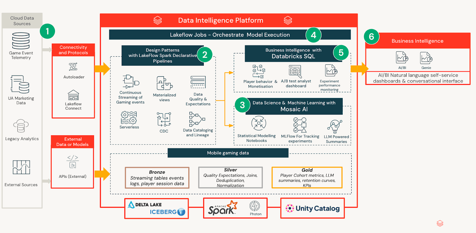
Data Ingestion & Modelling
Experiment definitions, player telemetry, and outcome metrics are ingested from internal pipelines and curated into governed tables with consistent schemas. This standardisation allows analysts and product teams to reason about experiments consistently, regardless of test design or duration. Notebooks are used to compute statistical models that calculate effect estimates, uncertainties and segment level impacts over time. Rather than embedding logic in dashboards or reports, all analytical outputs are materialised into a unified experiment analytics model. This creates a stable semantic layer that downstream consumers can rely on without re-running analysis or reinterpreting results.
AI/BI-powered Insight Delivery
On top of this governed analytics layer, Databricks AI/BI provides an accessible interface for consuming experiment results. Each daily refresh generates a succinct LLM summary aimed at non-technical stakeholders, translating validated statistical outputs into natural language. The dashboard uses progressive disclosure: users can stop at the summary when satisfied, or explore deeper layers of metrics, diagnostics, and segment analysis as their curiosity increases. This layered experience enables rapid scanning while keeping analytical depth available for expert validation.
Experiment Lifecycle and Persistence
During the live phase, the dashboard refreshes daily so teams can track trajectory and react to signals. At the conclusion, the dashboard freezes to preserve outcomes, decisions and recommended actions. This lifecycle creates an auditable record that accelerates onboarding and reduces duplicated analysis across future experiments.
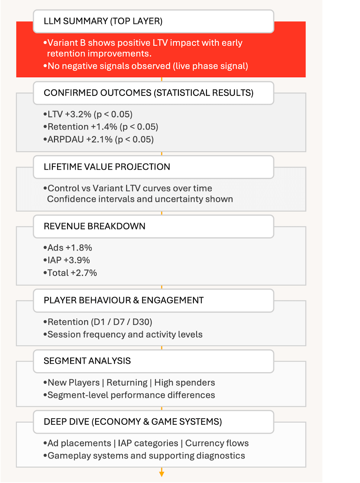
Dashboard Layers Explained
The dashboard is designed to guide users through an experiment’s results in a clear, deliberate sequence. It begins with simplicity and gradually unveils more detail for those interested in exploring further. Each section addresses a different question, and it’s entirely acceptable to stop once the reader has obtained the necessary information.
LLM-generated experiment summary: At the top of the dashboard is an LLM-generated summary. While an experiment is live, this gives a simple, high-level view of how things are going, highlighting early signals without drawing premature conclusions.
Once the experiment concludes, the summary changes role. It becomes a clear explanation of what happened, calling out the metrics that moved with high confidence, in priority order, and in plain language. The goal is to help teams quickly understand the outcome and why it matters.
Confirmed outcomes and statistical impact: For more technical audiences, the next section presents a structured view of statistically significant results. Key metrics such as player lifetime value (LTV) and retention are listed alongside effect sizes and confidence levels, making it easy to validate conclusions without digging into raw analysis.
Predicted lifetime value impact: The dashboard then shows the estimated impact on player lifetime value for control and variant groups. Uncertainty and error margins are shown explicitly, reinforcing that these are informed estimates, not absolute forecasts.
Revenue impact by source: Results are broken down by revenue stream, including ads, in-app purchases, and total revenue. This helps teams understand whether changes are broad-based or driven by specific monetisation channels.
Player engagement and behaviour: Beyond revenue, engagement metrics such as retention and session behaviour are surfaced to ensure business gains are considered alongside player experience and long-term health.
Segment-level analysis: Segmentation is central to how HARDlight designs and evaluates experiments. This section shows how different player segments respond to a change, whether defined by retention, progression, or other behavioural traits. It helps teams confirm that targeted experiences work as intended, without harming other parts of the player base.
Monetisation mechanics and game economy: Deeper layers explore how experiments affect in-game systems, including ad performance by placement, In App Purchase performance by product category, and changes to hard and soft currency flows across sources and sinks.
Core gameplay loops and appendices: At the deepest level, detailed charts and tables cover gameplay mechanics such as races, characters, and items, along with supporting statistical visuals. This layer is intended for expert users who want full transparency or need to reuse insights in future work.
Together, these layers let insight unfold naturally. Teams can move quickly when the answer is clear, or go deeper when questions arise, all while working from the same governed, trusted source of data.
This structure is made possible by Databricks AI/BI, which allows complex analytical outputs to be surfaced cleanly without embedding custom code or analyst-only workflows into dashboards. Statistical results, projections, and segment-level analyses are computed upstream in notebooks and materialised into governed tables, while AI/BI provides a flexible presentation layer on top. This removes the need to run Python inside dashboards, simplifies maintenance, and makes it feasible for a lean team to iterate on and evolve the system over time.
Just as importantly, AI/BI makes it possible to serve very different audiences from the same underlying data. Narrative summaries, tabular results, charts, and deep diagnostics can coexist without duplicating logic or fragmenting interpretation. This was a key shift from earlier approaches, where tooling constraints forced trade-offs between analytical depth, accessibility, and sustainability.
Impact & Results
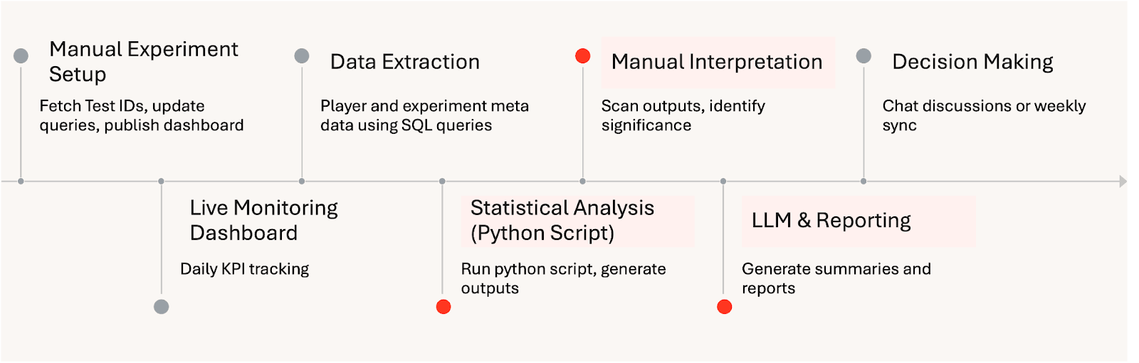
The framework has fundamentally changed how experimentation operates at HARDlight. By automating analysis and standardising statistical inference, the data team has reduced manual effort by more than eight hours per week. By standardising experiment runs with Databricks Workflows, the team eliminated much of the manual setup work previously required for each analysis. This saves roughly one day per experiment and has enabled a targeted two-times increase in monthly A/B testing capacity without increasing headcount.
Manual Experiment Analysis Workflow:
Automated Experiment Insight Delivery on Databricks:
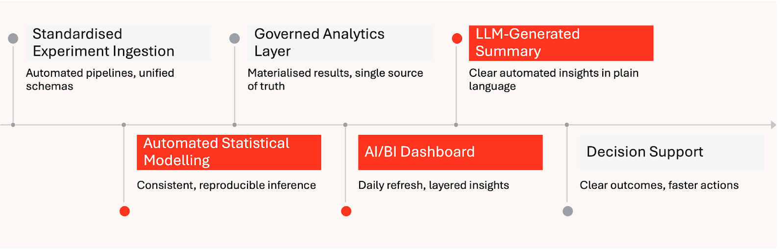
Beyond efficiency gains, the system has improved consistency and confidence in results. The frozen dashboard archive now acts as a durable source of truth for completed experiments, reducing repeated analysis and making it easier for teams to revisit past decisions with full context. This has significantly reduced the overhead of maintaining historical knowledge across teams.
Perhaps most importantly, the framework has changed how insights are consumed across the studio. With multiple experiments running in parallel, teams now receive daily, AI/BI-enabled updates that replace multi-day manual aggregation and interpretation. Genie will be enabled directly on the dashboard, allowing users to ask questions about what they are seeing and explore results in their own words, without needing to understand the underlying data model. Together, clear summaries, governed metrics, transparent statistical outputs, and conversational access have helped build trust across product, LiveOps, and engineering teams, reinforcing experimentation as a shared, scientific way of working.
What’s Next
HARDlight plans to extend the framework with a forecasting application, extending the framework from descriptive and inferential analytics into forward-looking guidance. The broader vision is predictive experimentation and closed-loop optimisation — using the Lakehouse to automate more of the cycle from hypothesis to deployment, while preserving governance and consistency with Unity Catalog, Spark Declarative Pipelines and MLflow. This dashboard-first approach can have significant impact for other studios with similar needs, layering LLM summaries over governed metrics and diagnostics to scale experimentation with confidence on Databricks.
Get the latest posts in your inbox
Subscribe to our blog and get the latest posts delivered to your inbox.