What’s New in AI/BI - February 2026 Roundup
Explore the latest innovations across Databricks AI/BI, including new experiences in Databricks One, Dashboards, Genie, and emerging agentic analytics capabilities.
by Julia Powell, Richard Tomlinson, Eason Gao, Hanlin Sun, Alex Lichen and Dillon Morrison
- Understand the latest AI/BI updates, including Databricks One reaching General Availability, Microsoft Teams channel subscriptions for dashboards, and major presentation upgrades like enhanced counters, workspace-level themes, and a denser canvas grid
- Learn how Genie continues to evolve for deeper analysis with Genie Research, expanded APIs for programmatic integration, and new ways to surface narrative insights
- See what’s coming next for AI/BI as agentic analytics expands across the stack, including natural-language dashboard authoring and in-dashboard Metric View creation that lowers the barrier to building governed analytics
Going into the new year, we’re continuing to invest in agentic analytics, where intelligent agents don’t just answer questions, but actively help users build, explore, and deliver analytics end-to-end. This month’s updates reflect that shift, introducing new capabilities that help authors create insights faster than ever.
Across Databricks AI/BI Dashboards, Genie, and Databricks One, we’re making full-stack analytics accessible through natural language: from exploring data, to building dashboards and metrics, to sharing insights at scale, all without the need for deep technical expertise.
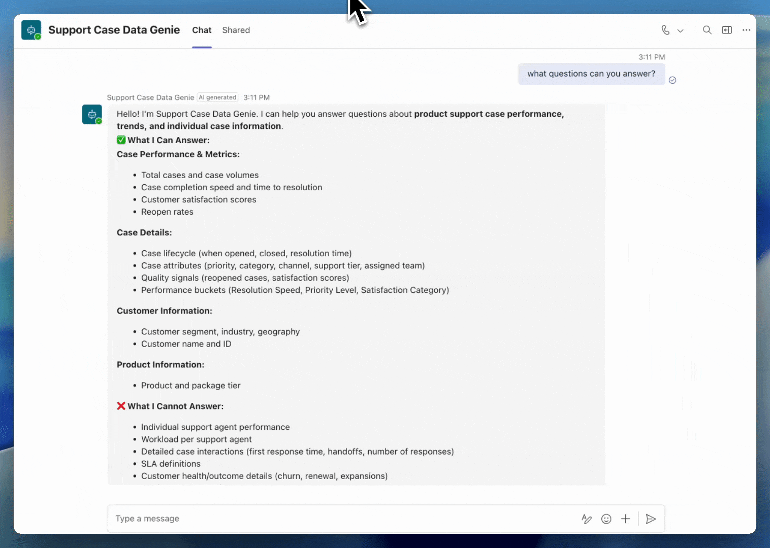
If you’re new to AI/BI, it’s Databricks’ built-in Business Intelligence (BI) experience within the Data Intelligence Platform, combining reporting, natural language analytics, and key semantic logic in one governed platform. With AI/BI, teams can explore data, ask follow-up questions, and share insights broadly without managing a separate BI system.
Let’s take a closer look at this month’s highlights!
What’s New?
The latest updates span AI/BI Dashboards and Genie, with improvements to insight delivery, dashboard presentation, and conversational analysis.
Databricks One workspace-level access
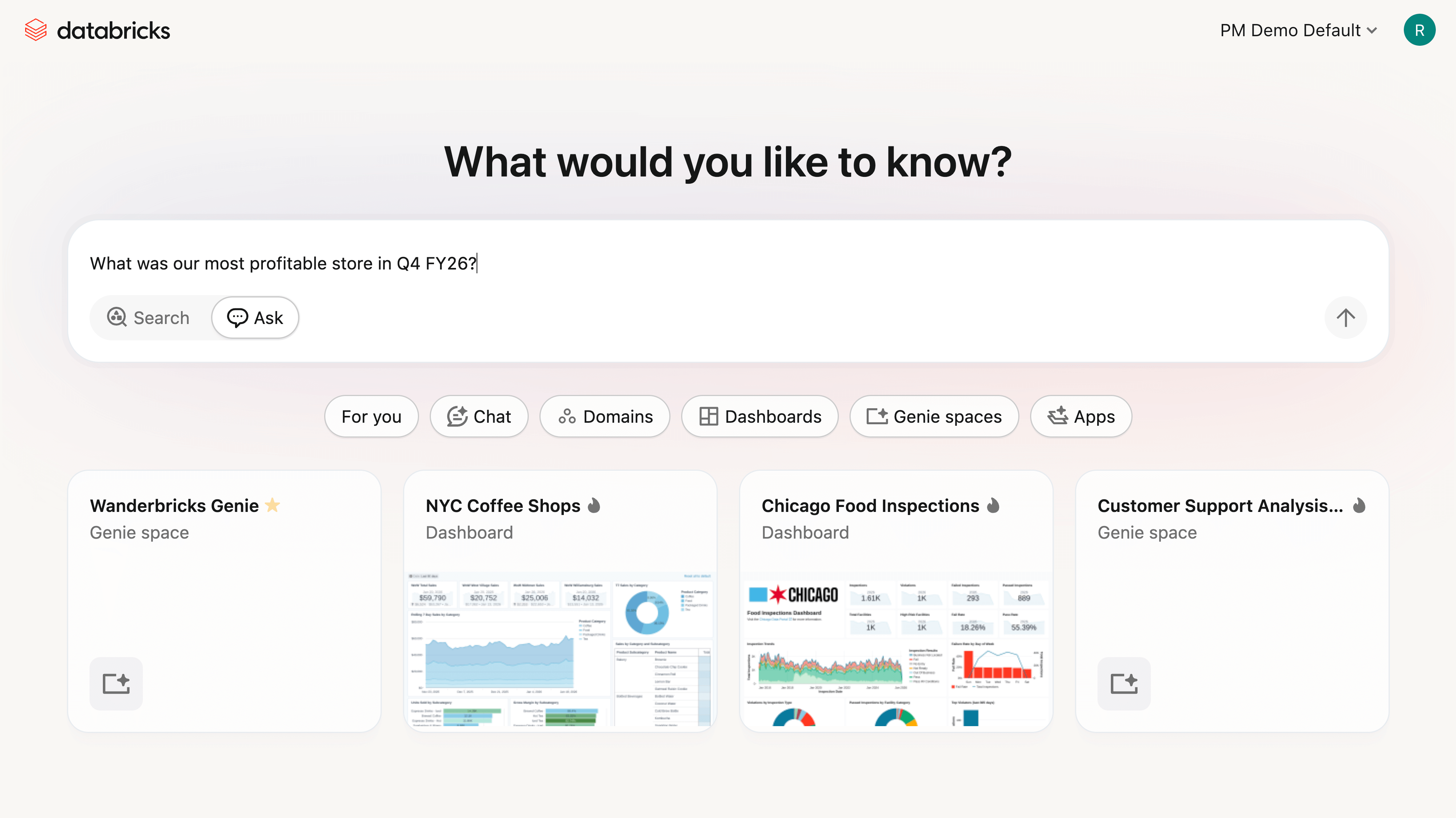
Databricks One workspace-level access is now generally available, providing customers with a business-friendly entry point to consume analytics and AI within an existing Databricks workspace. It serves as a single pane of glass for business users to discover, explore, and interact with trusted data products without exposing technical constructs such as compute, notebooks, or pipelines.
With Databricks One, business users can:
- Discover new dashboards, Genie spaces, and apps by topic, popularity, or author
- View and interact with AI/BI Dashboards to track KPIs and explore metrics
- Ask questions in natural language using Genie
- Use Databricks Apps that combine analytics, AI, and workflows in purpose-built interfaces
This release makes it easier for business users to discover the right dashboards and Genie spaces without relying on manual navigation or tribal knowledge. The updated For You page now surfaces recent activity and favorites, so the content users rely on most is always within reach. Search is smarter as well. Certified and favorited assets are boosted in the rankings, helping trusted content rise to the top. Users can mark dashboards and Genie spaces as favorites with a simple star click in Databricks One, and filter results by favorite or certified status to quickly narrow in on content they can trust.
Databricks One workspace-level GA builds on last year’s public preview and reflects Databricks’ continued investment in expanding analytics access beyond technical practitioners, while maintaining centralized governance through Unity Catalog.
Agentic dashboard authoring
Agentic dashboard authoring allows users to create and maintain AI/BI Dashboards end to end. From the Assistant panel, users can search for relevant tables based on their Unity Catalog permissions, create datasets, generate visualizations, configure filters, and organize multi page dashboard layouts, all from a single prompt. Dashboard authors are prompted to review and approve plans and confirm next steps, ensuring they remain in control while accelerating dashboard creation and iteration.
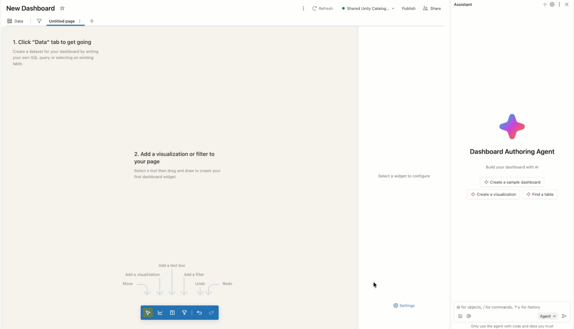
Instead of generating one off queries, the dashboard agent builds reusable semantic definitions that can power multiple visualizations. It connects those definitions to filters, calculations, and layouts that scale as dashboards grow, helping teams move faster while maintaining consistency. This experience is powered by an agentic loop that creates a plan and reasons step by step through users prompts. Authors can view reasoning traces, pause the assistant to make corrections, and retry as needed.
For more information about agentic dashboard authoring, see the documentation.
Genie research
Genie research enables users to perform deeper exploratory analysis. To answer complex questions, Genie research creates a plan, executes multiple SQL queries to gather evidence, and iteratively reasons through results until it produces a comprehensive, well-supported answer.
Unlike standard Genie queries, Genie research is purpose-built for complex analytical questions, such as understanding the drivers behind a revenue spike, identifying factors contributing to churn, or even suggesting improvements to a marketing campaign. The final output is a detailed report that includes clear conclusions, supporting tables and visualizations, and citations to the underlying research steps.
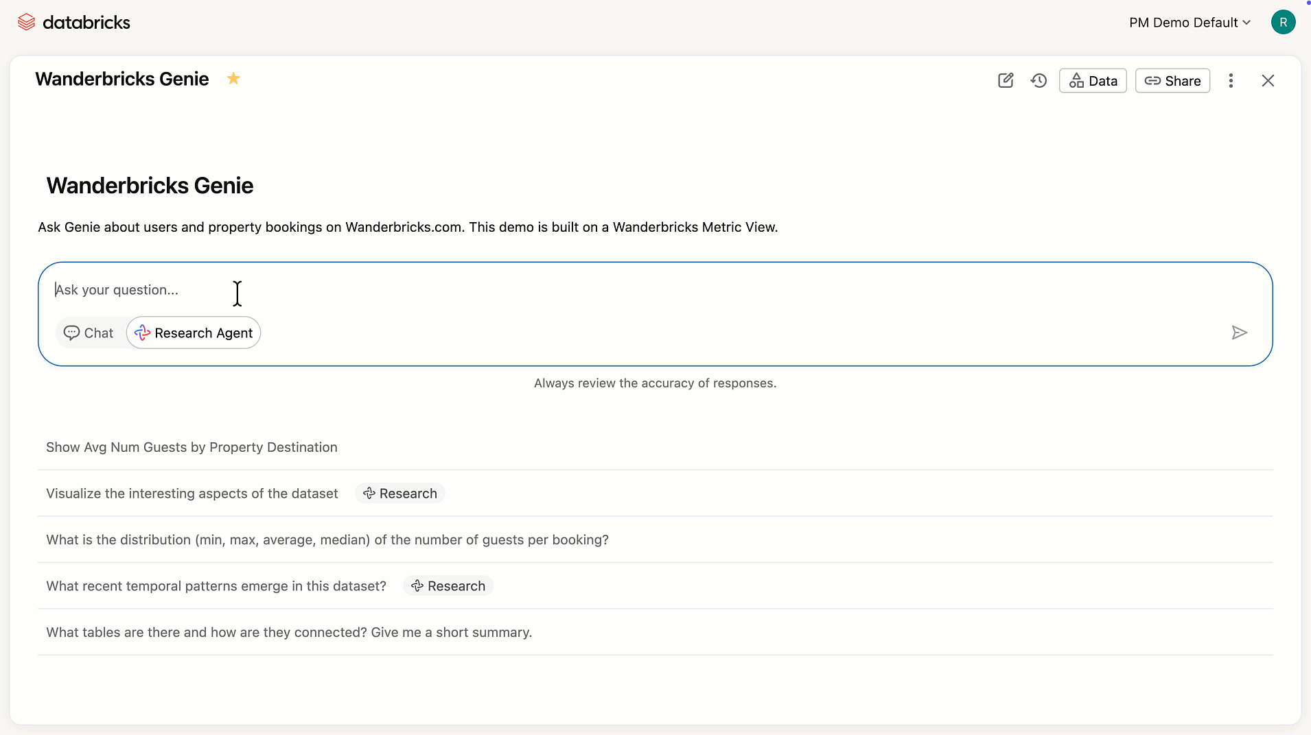
Recent improvements make Genie research more practical for everyday analytical workflows. Reports can now be downloaded as PDFs for sharing or offline review, making it easier to circulate findings with stakeholders. Genie research has also moved to a single-agent architecture, which improves instruction following, enhances visualization quality, reduces latency, and produces more concise, focused reports. Together, these updates make it easier to go from an open-ended question to a shareable, well-supported conclusion.
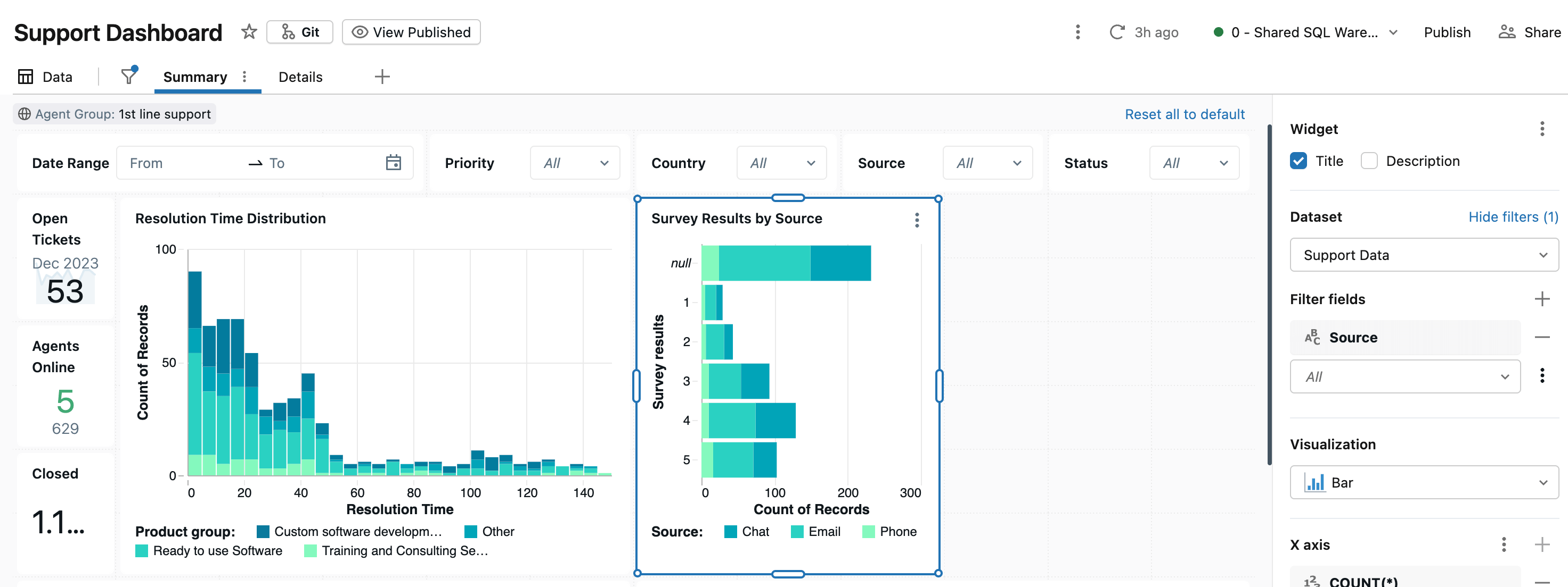
Level of detail (LOD) expressions for Dashboard Custom Calculations
Level of detail (LOD) expressions give authors precise control over how metrics created in custom calculations are aggregated in a dashboard visualization, even when charts are grouped differently or filters are applied. You can define LOD expressions at a fixed or courser level of detail.
Fixed level of detail expressions compute an aggregate across a specified dimension, creating a scalar dimension column as a result. Suppose you have a sales dataset and want to show each product's sales alongside the total sales for its region. Here's some sample input data:
To calculate total sales by region, users can add a new custom calculation called 'all_region_sales', defined as follows:
This would return the following:
Above, each row shows the individual product sales and the fixed total for its region. The region total remains constant regardless of how you filter or group by product. To compute percent of regional sales, you could define:
Which returns the following:
In contrast, a coarser LOD calculation defines a measure that intentionally ignores one of the chart’s groupings. If we take the same example data above, we could also calculate percent of regional sales as follows:
This defines a measure that can then be used on a dashboard visualization. For instance, we could place this measure on the Y axis of a bar chart, and plot it by Region to get % of regional sales by product. Because this is a measure, as filter values change, the chart will recompute the % of regional sales based on the filtered values.
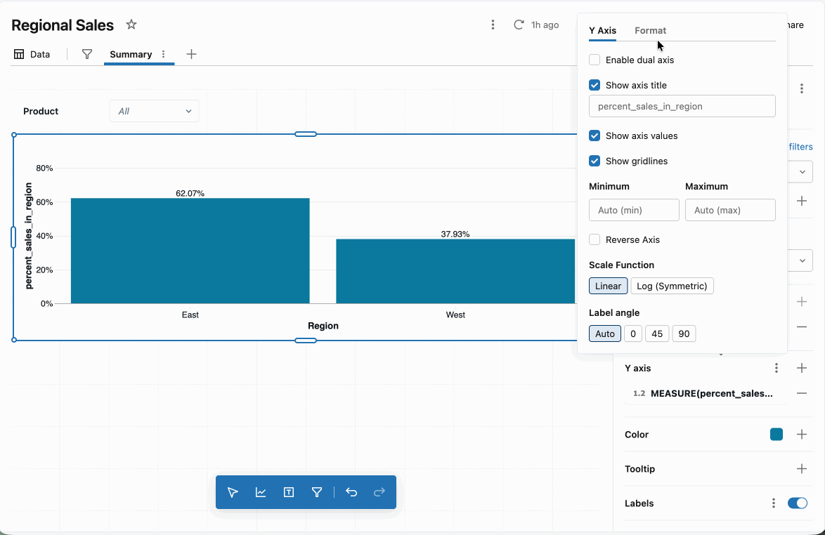
For a full list of LOD expressions, please check out the product documentation.
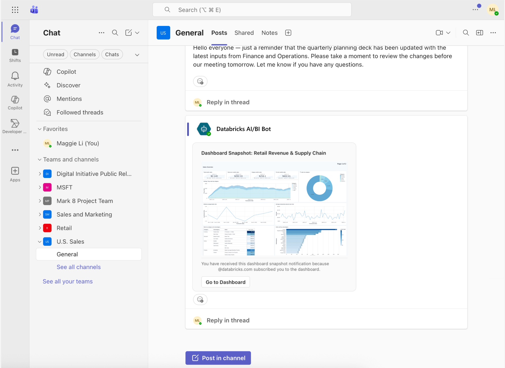
Dashboard subscriptions to Microsoft Teams channels
AI/BI Dashboards can now deliver scheduled snapshots directly to Microsoft Teams channels, making it easier to bring trusted insights into the tools teams already use every day. Instead of asking stakeholders to log into Databricks to check dashboards, authors can proactively push updates on a schedule, keeping everyone aligned without additional manual effort.
Each Teams notification includes a PNG preview of the dashboard, a direct link to open it in Databricks, and a PDF snapshot attachment in the message thread. Teams subscriptions work alongside existing dashboard schedules, ensuring that snapshots are delivered only after the latest data refresh completes. This makes it simple to keep business users informed with timely, governed insights right where conversations and decisions are already happening.
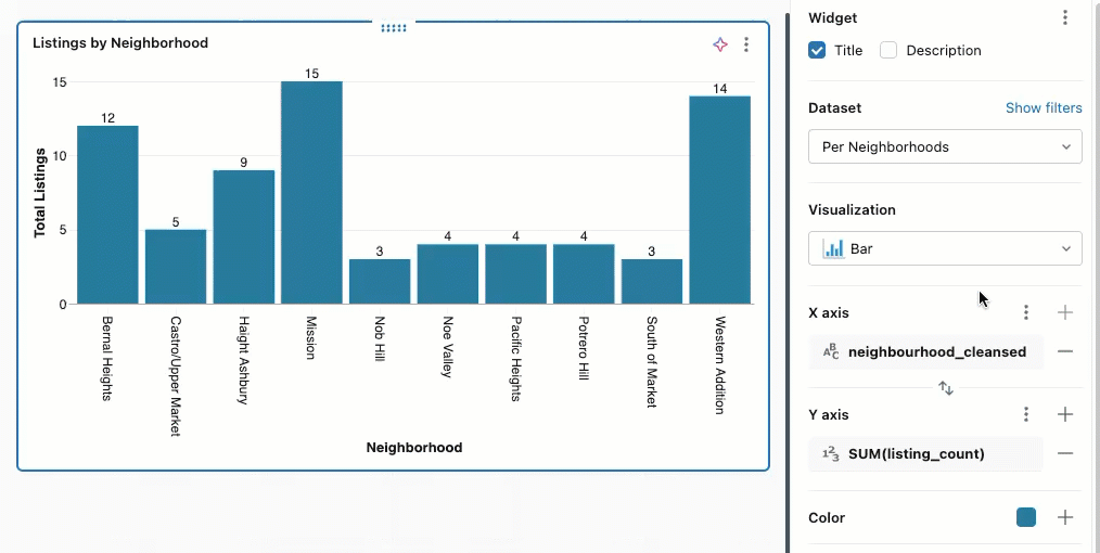
Dashboard presentation and polish upgrades
This release includes a broad set of enhancements focused on making dashboards clearer, more expressive, and easier to present—especially for executive and stakeholder-facing use cases. Together, these updates give authors more control over layout, styling, and how key metrics are communicated at a glance.
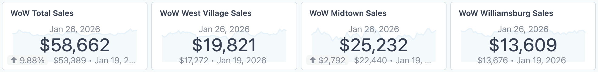
Counter visualizations with period-over-period comparisons and sparklines
Counters now make it easier to highlight a single KPI while still providing essential context. Authors can configure counters to compare a primary value against an offset value (such as the previous day or week) and optionally include a sparkline to show how the metric has changed over time. Conditional formatting and text-style controls help draw attention to meaningful changes, turning counters into compact, presentation-ready summary widgets.
Workspace-level dashboard themes
Workspace-level themes make it easier to apply consistent styling across dashboards within a workspace. By centralizing common visual choices—such as colors and text styles—teams can maintain a cohesive, on-brand look without manually configuring each dashboard. This is especially useful for organizations standardizing analytics for broad internal audiences.
Higher density canvas
Dashboards are also becoming more flexible in layout. We’ve updated our grid from 6 horizontal snap points to 12, creating a denser canvas grid that provides finer-grained control over widget placement, making it easier to align content precisely and fit more information into a single view. This is particularly helpful for KPI-heavy dashboards and executive summaries, where authors want tighter layouts without sacrificing readability.
Improved Pivot Table visualizations
Pivot tables are a core tool for exploring multidimensional data, and this release introduces several enhancements that make them easier to read, analyze, and share.
Pivot tables now automatically resize to fit their widget by default, helping dashboards maintain clean, consistent layouts without manual adjustment. They also support cross-filtering, allowing users to click values directly within a pivot table to dynamically filter other visualizations on the dashboard, making exploratory analysis more interactive and intuitive.
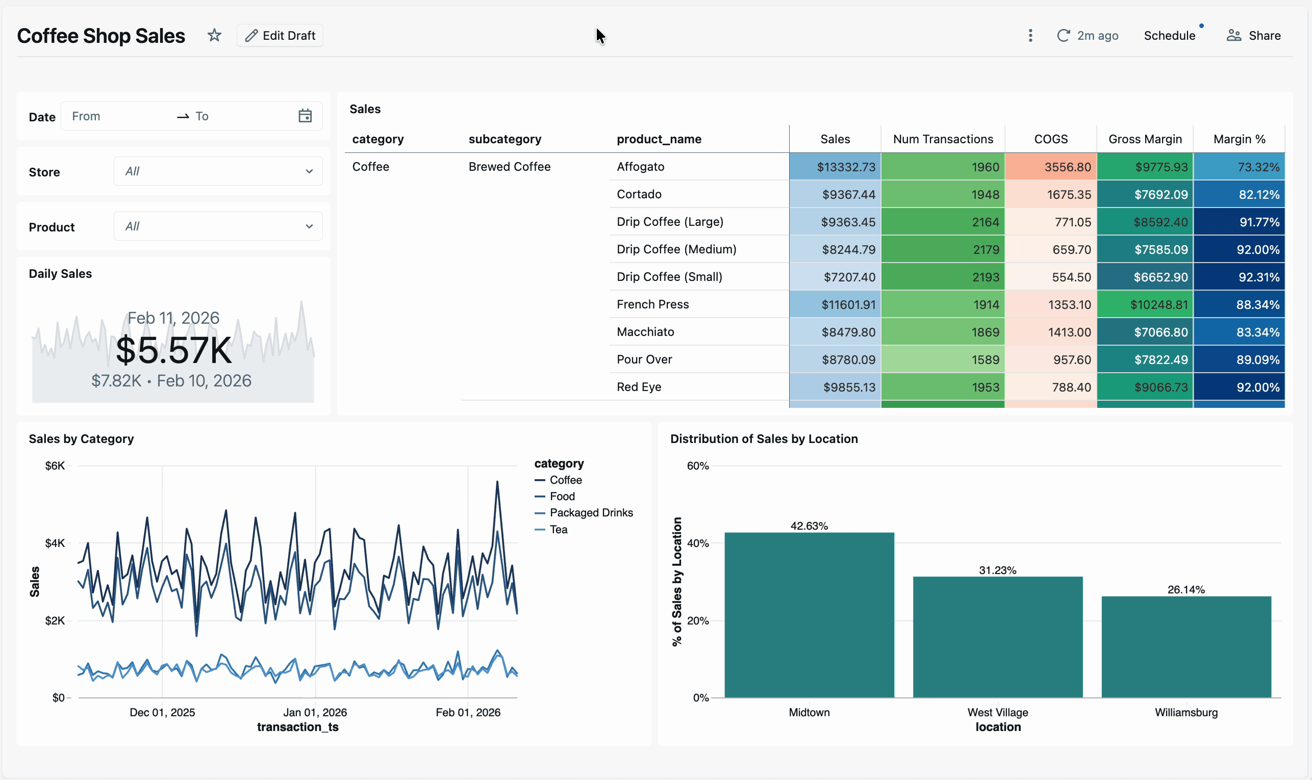
Pivot table data export has also been improved. When downloading data, exported datasets now preserve the pivoted structure (including Excel exports), making it easier to reuse results in external tools without additional reshaping. Authors also gain more formatting control, including adjustable column header heights and support for HTML cell rendering, helping teams present dense analytical data more clearly.
Genie API enhancements
For teams building applications or automations on top of conversational analytics, Genie’s APIs/SDK continue to expand—making it easier to manage Genie spaces programmatically and integrate Genie’s intelligence into custom workflows.
Create and update APIs
Genie create and update APIs allow developers to programmatically manage Genie spaces, including creating new spaces, updating definitions, and retrieving serialized space configurations. These endpoints make it easier to manage space development, deploy spaces across environments, and integrate Genie into existing data and application pipelines.
Text summaries via the get conversation message API
The Get conversation message API supports retrieving natural language summaries in addition to structured table results. Each question can now return a narrative explanation via API—ideal for embedding Genie into chatbots, applications, or agent workflows where human-readable answers are needed to complement structured table responses.
Retrieve full query results API
Users can now pull complete query results via API for use in downstream workflows—running additional analytics, forwarding to other services, etc. This feature is now in Beta. There is a generate full query result download API to trigger the SQL execution and a get download full query result API to retrieve the download.
Genie integration with Microsoft Copilot Studio
Genie is also becoming easier to extend beyond the Databricks UI. With a new integration to Microsoft Copilot Studio, Genie spaces can be connected to Copilot Studio agents in just a few clicks, making trusted, governed data available directly within your Microsoft ecosystem.
This integration allows organizations to expose Genie’s conversational analytics inside tools like Microsoft Teams and M365 Copilot, helping business users ask questions and get answers without switching contexts. By bringing Genie’s unique business semantic understanding into Copilot workflows, teams can scale access to reliable insights while maintaining governance and consistency across platforms.
Other notable features
In addition to the launches above, we’ve continued to add a steady stream of improvements across both AI/BI Dashboards and Genie, focused on usability, clarity, governance, and scale. Below are several notable updates from recent months; for the complete list of new features and fixes, please refer to the product release notes.
AI/BI Dashboards
- More flexible filtering controls: Dashboards now support static per-widget date and numeric filters, relative date presets, and copy/pasting filter values directly from spreadsheets, giving viewers more precise and convenient control over how data is filtered during exploration.
Improved chart clarity and customization: Ongoing visualization refinements improve readability and control across dashboards. Authors can now enable individual series labels, sort visualizations by hidden measures, adjust map legend positions, and better handle crowded tooltips and long axis labels, making dense or complex charts easier to interpret.
- Better performance and navigation at scale: Improvements such as faster pivot table rendering, enhanced dashboard search, more reliable cross-filtering, and smoother browser navigation help large dashboards perform more consistently and remain easy to work with as they grow in size and complexity.
- Dozens of usability and formatting refinements: Smaller quality-of-life updates—from Boolean alias formatting and richer date presets to cleaner downloads and more consistent widget behavior—continue to make dashboards faster, clearer, and more polished for both authors and viewers.
Genie
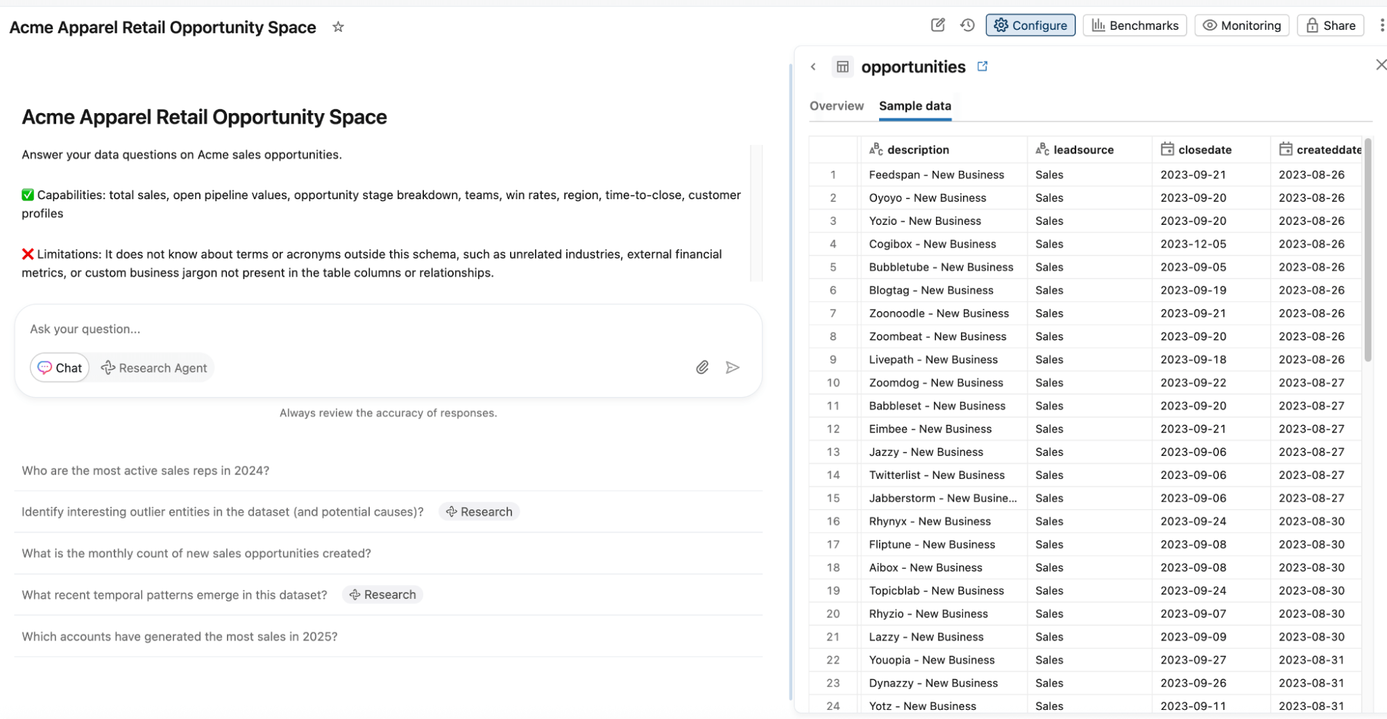
Improved non-technical user experience: Genie continues to become more intuitive for everyday business users. We’ve simplified the chat home page, improved the readability of numeric query results, introduced a new Sample Data tab for space context, and smartly collapse result tables when natural language answers are more effective.
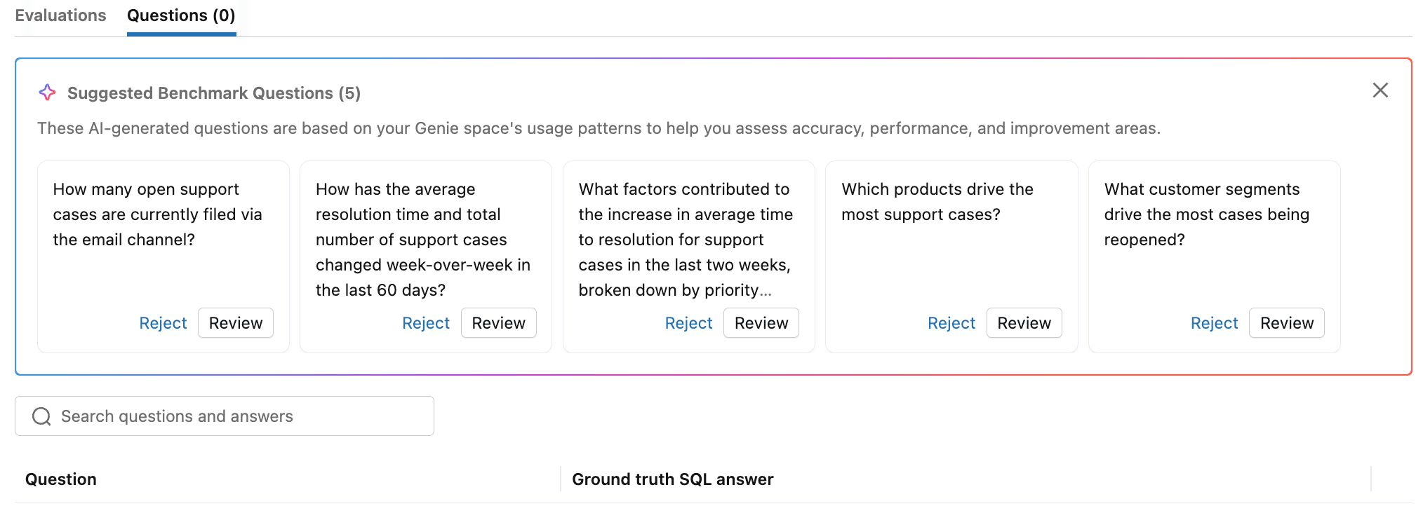
Expanded authoring tools: Space authors can now more effectively evaluate their spaces with auto-suggested benchmark questions and natural language benchmark error explanations. It’s now easier to iterate on the space’s context with bulk actions for entity matching. Finally, authors can now rerun queries from other space users under their own data credentials to more effectively review user feedback.
- Deeper Integrations with Unity Catalog: Users can now track Genie spaces in Unity Catalog lineage to centrally govern these assets. Admins can now also add certified tags to Genie spaces, to help users discover certified spaces and understand which are deprecated.
- Improved context handling: We are constantly improving the core quality of Genie’s conversational analytics capabilities. Entity matching now scans up to 100 million rows to better detect the most frequently occurring unique values, improving Genie’s ability to correct spelling issues in user prompts and generate more reliable SQL. Authors can now also write general instructions that customize Genie’s natural language text summaries.
What’s next?
Building on recent updates, we’re continuing to expand AI/BI with new capabilities that deepen analytical workflows, improve usability, and make it easier to deliver trusted insights at scale. Below is a preview of a few of the features we’re actively working on:
- Databricks One Account-level experience. Databricks One will provide an account-level interface for discovering and consuming dashboards, Genie spaces, and apps across all workspaces. Business users can access content shared at the account level without switching workspaces.
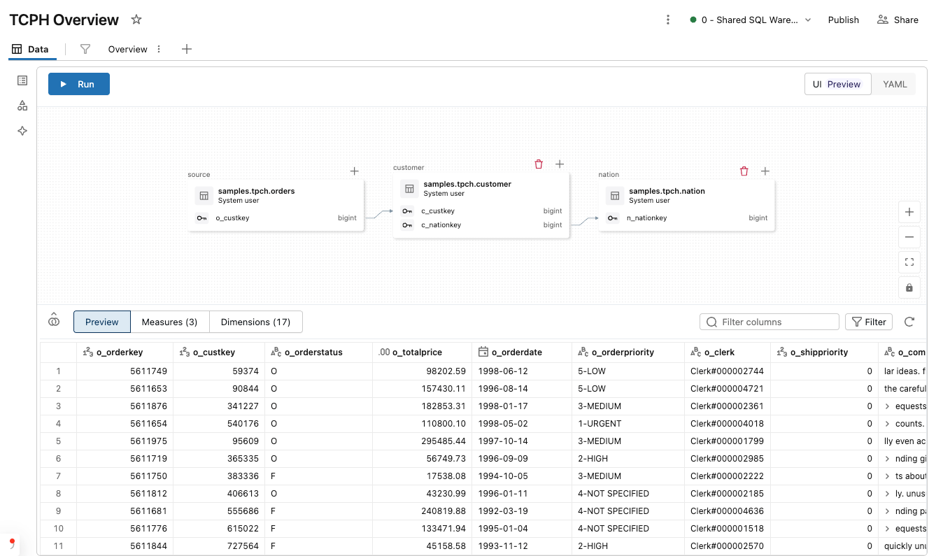
We are expanding Metric View creation into AI/BI Dashboards and bringing a new low-code authoring experience into AI/BI Dashboards, so that analysts and business users will be able to visually define joins, measures, dimensions, and filters while building dashboards, without writing SQL. Dashboard datasets will now have the same level of expressivity as Metric Views governed in Unity Catalog, combining self-service speed with centralized metric standardization and faster delivery of trusted insights.
Learn more
If you are excited about where AI/BI are heading, now is a great time to start exploring these capabilities hands-on. Whether you’re building dashboards, experimenting with conversational analytics, or scaling governed insights across your organization, there are several ways to dive deeper:
- Free Trial: Get hands-on experience by signing up for a free trial.
- Documentation: Dive deeper into the details with our documentation.
- Webpage: Visit our webpage to learn more.
- Demos: Watch our demo videos, take product tours, and get hands-on tutorials to see these AI/BI in action.
- Training: Get started with free product training through Databricks Academy
We’re continuing to invest heavily in AI/BI and agentic analytics, and we’re excited to share more innovations with you throughout the year.
Get the latest posts in your inbox
Subscribe to our blog and get the latest posts delivered to your inbox.