Announcing updates to Databricks Query Profiles
Modernized experience for your performance-tuning delight
- Enhanced Query Insights: Redesigned Query Profiles offer a clearer view of query performance.
- Improved Optimization Tools: Features like the new Top Operators panel help you spot performance bottlenecks.
- Streamlined Analysis: Easily zoom to any node, filter, and explore in a highly interactive graph.
At Databricks, we’re always working hard to make your queries run faster. Still, there are times when it is helpful to look a little deeper to see how your queries are turned into execution plans and distributed for parallel execution.
That’s where Query Profiles come in. We introduced them in the very first release of Databricks SQL. Since then, we’ve extended coverage to SQL and Python code running on Serverless Compute for Notebooks and Workflows, as well as DLT Pipelines.
Thanks to your feedback, we’ve made Query Profiles even better. Now available across all Clouds, the new experience makes it easier and more enjoyable to fine-tune performance and solve bottlenecks.
Query Profiles: Your performance tuning companion
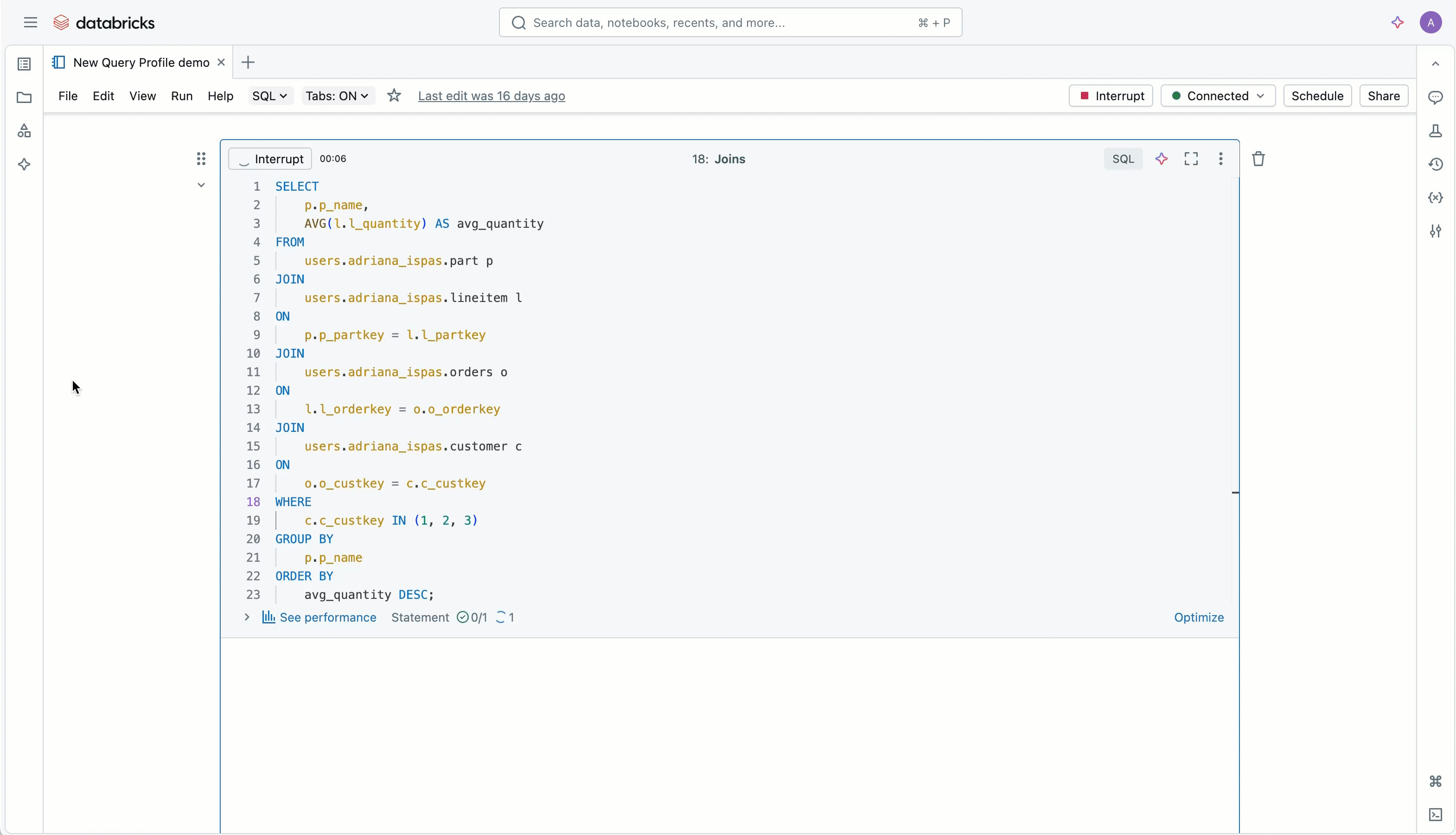
Query Profiles help you understand how your queries run, whether you’re using SQL, Python DataFrames, or DLT pipelines. They help you spot slow parts for each query, understand what happens during execution, and guide your performance-tuning decisions. Check out the video below to see Query Profiles in action—and try them out.
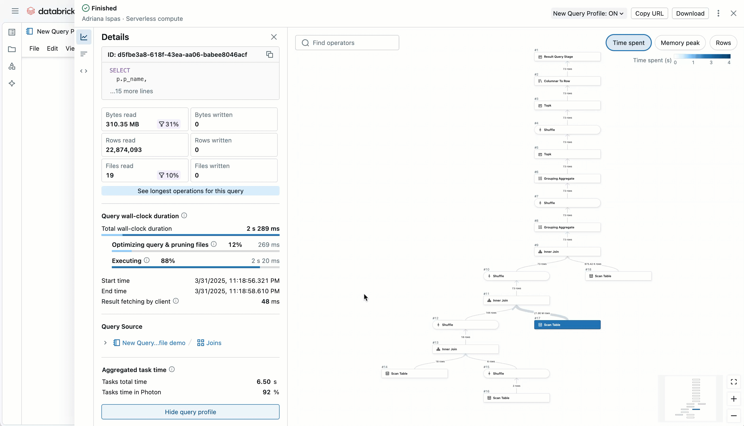
The upgraded interface is highly interactive and intuitive. You can explore execution plans visually, see which operations were involved, like scans or joins, and quickly dive into metrics that show where time and resources were spent, whether the query is still running or already completed.
You’ll find Query Profiles across Databricks: on the Query History page, Notebooks, the SQL Editor, Jobs UI, and DLT Pipelines. They’re also integrated with the Databricks Assistant when using the /optimize command.
From fine-tuning queries during development to investigating slow jobs or pipelines or digging into details after you’ve spotted outliers using the Query History system table, Query Profiles are your go-to tool for understanding and improving performance.
A smarter overview before you dive in
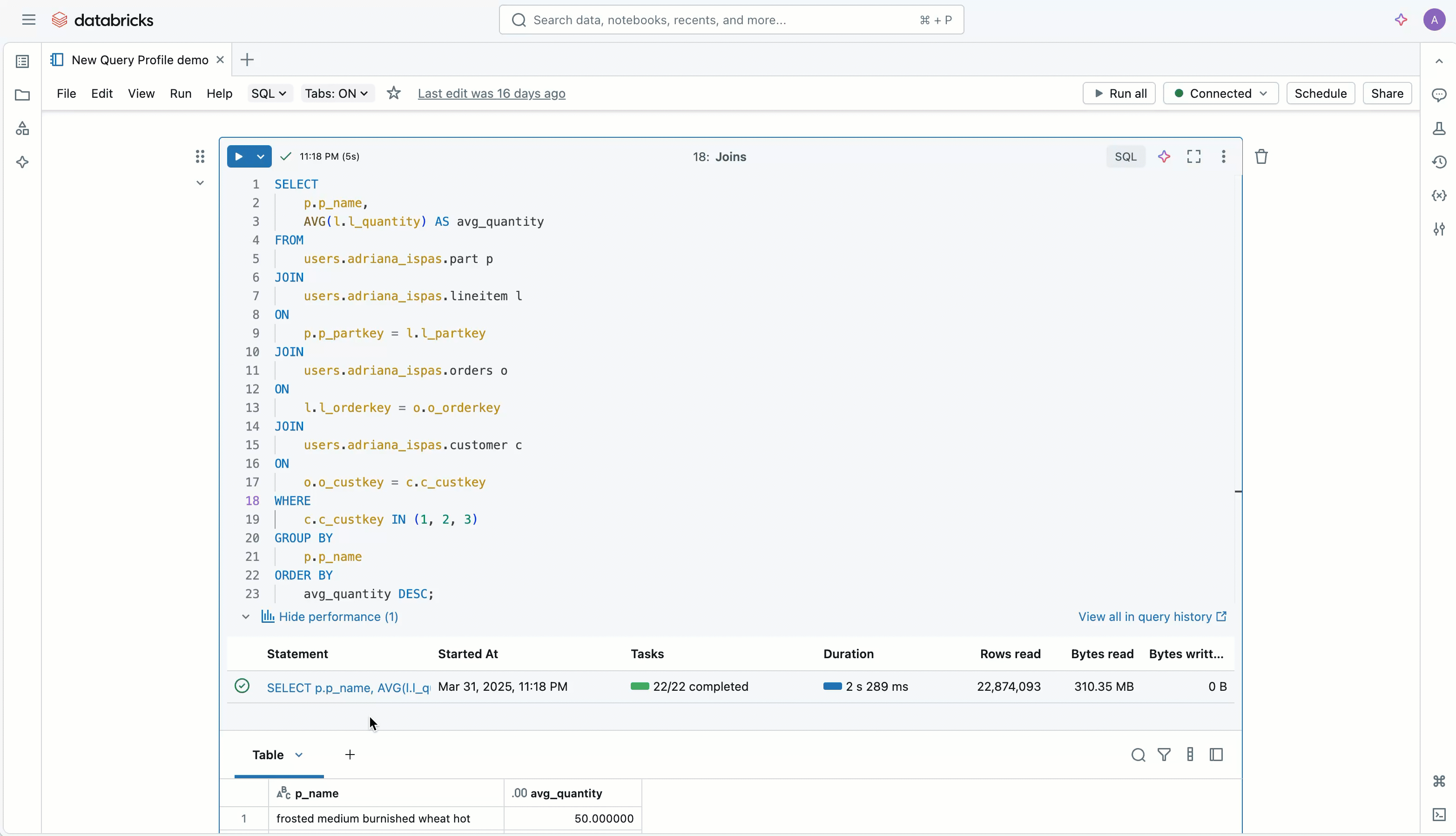
We’ve reimagined the query summary panel to give you a clearer picture of your query before you even open the complete profile. Whether you’re reviewing a statement from Query History or actively developing in an editor, you get an overview at a glance.
You’ll see a visual summary of read/write metrics and your filters’ effectiveness, so you can immediately tell how much data was pruned. You’ll also get a sneak peek into your query profile's overall shape and complexity, along with a high-level breakdown of where time was spent (execution vs. other steps like optimization).
A quick link takes you straight to the new Top Operators panel, and the query source is now just a click away, making it easy to jump back to the exact piece of code that generated the query, even from places like Query History or Jobs pages where direct editing isn’t possible.
Plus, you’ll find a summary of key metrics aggregated across all operators, so you can quickly spot red flags even before looking at the entire execution plan.
Brand-new Top operators panel
The new Top operators panel surfaces the most expensive parts of your query right away, so you can quickly zero in on the biggest opportunities for optimization. You get a ranked list of operators, making it easy to focus your tuning efforts on where they’ll have the most impact.
We’ve added interactive controls: just click an operator in the panel to zoom into that part of the graph and instantly see detailed metrics. It’s a faster way to explore performance hotspots in your query plan.
A sleeker and faster way to explore the execution graph
We’ve redesigned the execution graph to make navigating more straightforward and efficient. You can now zoom directly to any node, filter nodes by keyword, and view richer details, all within a cleaner, more polished interface.
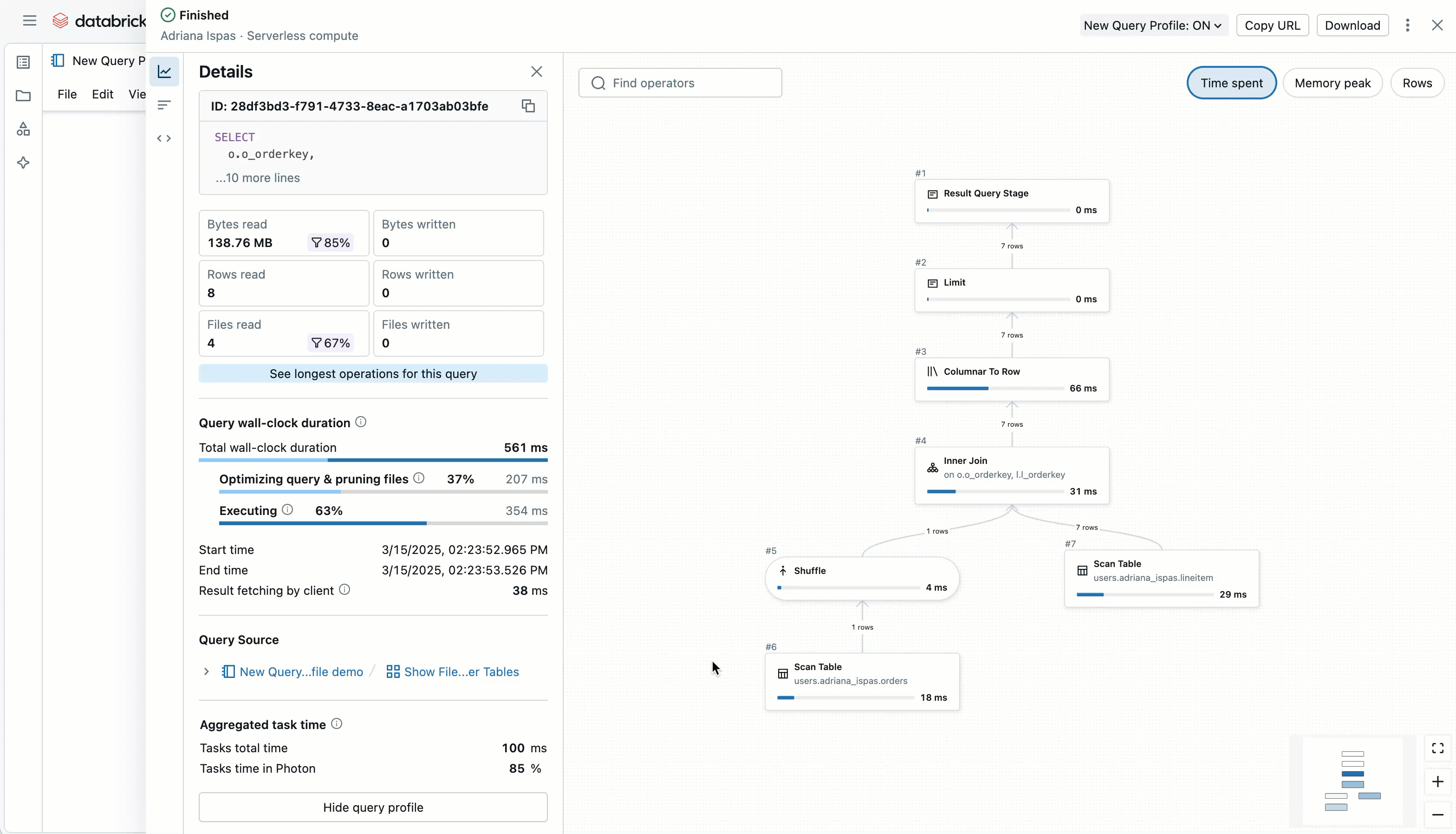
Large graphs are also easier to manage. We’ve introduced a minimized node view when zoomed out, which reduces visual noise while highlighting the most expensive nodes in your plan. This feature lets you quickly spot performance hotspots and decide where to zoom in and investigate further.
You can choose what to focus on: toggle between time spent, memory used, or rows processed. The time spent metric, in particular, helps pinpoint where the most intensive work happened—it aggregates execution time across all tasks that executed your code in parallel across multiple worker nodes in your clusters.
Easier access to operator metrics
We’ve simplified exploring and analyzing operator metrics. The updated layout presents key details more clearly, and a new filter option lets you quickly narrow down the metrics you care about—no more endless scrolling.
Need to take your analysis elsewhere? You can now export operator metrics to CSV with a single click. Plus, we’ve added table-level insights for Scan operators to give you an overview of key details for the tables you read.
What’s next
We’re not stopping here. Here’s a preview of what we are currently exploring:
- Smarter insights and tuning suggestions built into the query profile.
- Tighter integration with the Databricks Assistant’s /optimize feature.
- Query insights as a system table so you can monitor performance at scale.
Let us know what else you’d like to see — your feedback drives what we build.
Ready to dive in? Explore the new Query Profile in Databricks SQL, or try Databricks SQL for free. Query Profiles also support Serverless Compute for Notebooks, Workflows and DLT!
Get the latest posts in your inbox
Subscribe to our blog and get the latest posts delivered to your inbox.